 Home
Home

 Artists
 Search
 Recent
 Random
 Posts
Posts
 DMs
DMs
 Tags
Tags
 Random
 Importer
 Import
 FAQ
FAQ
 Account
 Register
 Favorites
 Login
Login

Month of boredom: bendy doggo WIP 08 (Patreon)
Content
But it's nearly done, I promise! Here's what we had last time:
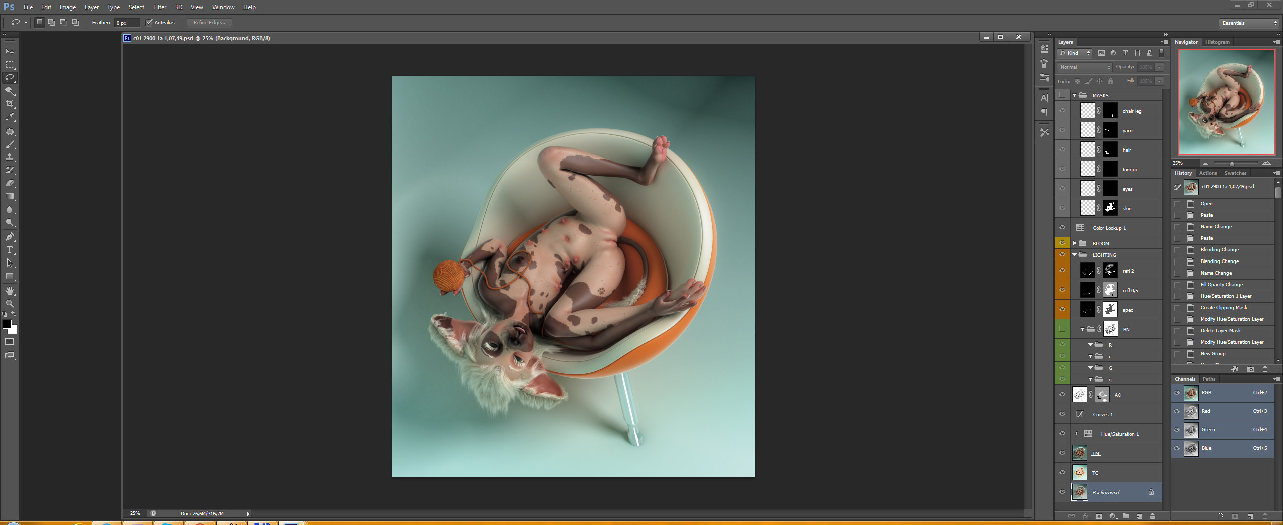
Now I shall start working on the normal pass light emphasis stuff thing. Very important. I'll try to go slightly into more detail on this stage; it's kinda complex. Take a look at that group marked green there, called BN. That's the group structure for this thing. That entire group is masked off with the ambient occlusion pass, so that we will get mostly convincing lighting. The groups inside are just color channels from the normal pass - R = red (left), r = negative red (right), etc. Now we need to actually add the masks.

Here's a modified normal pass, suitable for mask extraction. It's darkened and clipped at the middle value range (seen on the curves adjustment) - this way only about 25-30% of any curved surface will be clearly affected by the added lighting (we needed this contrast because we don't want to wash everything out). This is a bit like rim lighting - it helps isolate your subject from the background, makes affected things pop out more, improves readability of really small details, and just looks frickin cool.
This is what the individual channels look like...
Red:

Negative red:

Green:

Negative green:

I'm just dragging these into the final .psd, and assigning them to the 'R' 'r' 'G' 'g' groups. NOTE: sometimes there's also a B group (for the blue channel), when I want to add some faux specular shininess. We don't need that for this piece, but here's what that looks like:

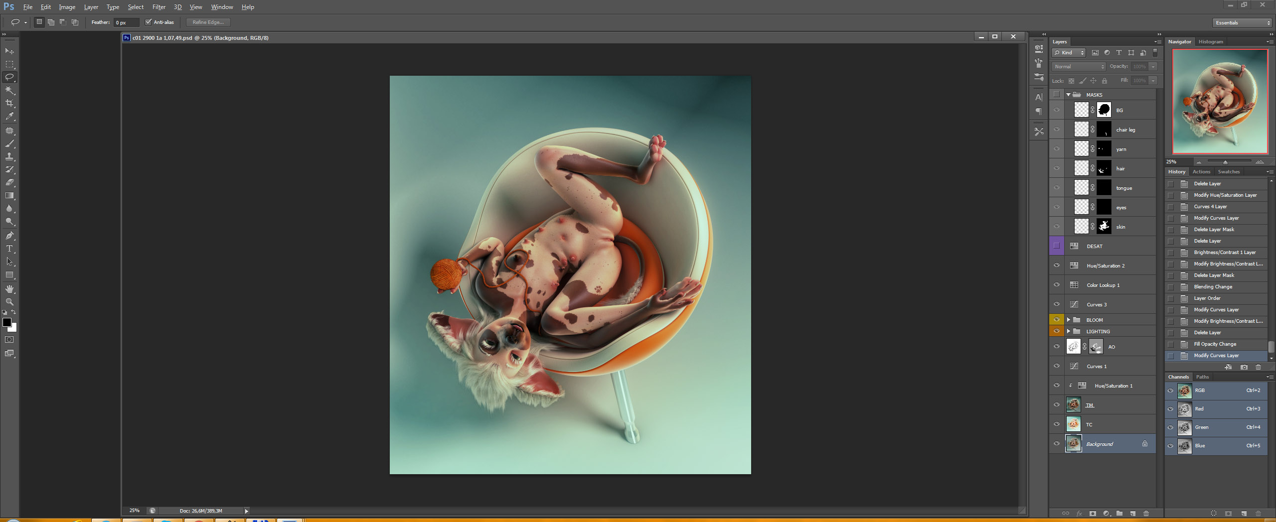
So once those mask are assigned, I will put color fills inside each group, with colors that match the environment, or ones that work for the composition. Here's the result:

I used a gradient for one of them, as that made more sense for a sorta global illumination feel. Nothing fancy tho. The blend modes are either screen or linear dodge, depending on the effect I want to achieve. Their opacities are at 50% this time, but that also varies in other pieces. Always experiment to see what works best in a specific case!
Anyway, now we need to paint some masks to control where we want the lights and where we don't, because it rarely looks good without that step. This is also why I didn't assign the normal pass channel masks directly to the color fills - we still need to mask them with a second mask (and I don't like rasterizing stuff and applying masks; I like to have things modular, it comes in handy).
So here's our lighting emphasis done:

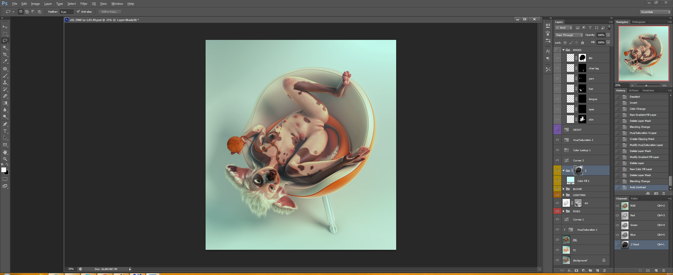
Now let's play around with some color processing! I checked this piece on my secondary screen, and it turned out the image was too flat, so other than some color changes via curves, I also increased the contrast a bit. Here's the result:
Looking good! There are just two/three things remaining: minor fixes to hair and eyes (actually very important - they add a lot of life to characters), gotta try adding some atmosphere via the z-depth pass, and add signature/watermark stuff. Let's do the fixes.
First, hair. Here's how that looks:

Just using the refraction, reflection, specular, and ambient occlusion elements to make the hair less dull-looking. Now for the eyes - extremely important, as you may know. Here's a before:

And an after:

A.K.A. "How to make dead eyes into live ones just by making them brighter via refraction render element, emphasizing their reflections, adding more AO, some faux highlights, and a little saturation"
Now that that's outta the way, let's see if using Z depth makes sense here.
It doesn't. :^)
I mean it looks kinda nice, but it's not what I had envisioned. If I wanted this, I'd just make the fog inside Max for more accuracy.
Also I've just remembered that I wanted to make the yarn more yellowish to make it more noticeable, so let's do that now!

This was way trickier than I expected. :^) But it looks great. Needed a curves adjustments to bump up the green channel, and also to desaturate the whole thing slightly, then a brightness/contrast adjustment, mostly to make it brighter and less contrasty, and lastly a bit of manual painting to improve its reaction to light.
Now I'll just slap a big ol' watermark on it, including a huge Patreon logo covering up Jinjing-Yu's bits, because that's what all the nicest artists do, and also I am a festering liar and someone please shoot me as soon as I decide that doing such atrocities is a good idea.

There. A nice, subtle watermark and signature.
THIS IS DONE NOW
Probably.
I think.
Now I just need to flatten it, apply mild chromatic aberrations, export in two sizes, come up with a title (my nemesis, that), and it's ready for posting!
Sooooooon. Unless I won't manage to come up with a title today. ._.
I hope this entire WIP post series was enjoyable at least for a few of you. I'm not very convinced about that, since there weren't that many comments or likes the further we went. XD But hey, it was requested numerous times that I go into detail on my workflow, so there you go! :D
P.S. Just added a very mild cooling filter as well.

It was too green.
NOW it's done.
Files
