 Home
Home

 Artists
 Search
 Recent
 Random
 Posts
Posts
 DMs
DMs
 Tags
Tags
 Random
 Importer
 Import
 FAQ
FAQ
 Account
 Register
 Favorites
 Login
Login

10 / 25 Emergency food WP (Patreon)
Content
※주의 ! gif 이미지가 포함되어 있으니, 패트리온 어플을 제외한 환경에서 읽어주세요! 패트리온 어플은 이미지를 강제로 리사이징 하기 때문에 gif를 재생할 수가 없습니다!
// ※Caution! gif The image is included, so please read it in an environment other than the Patrion app! The Gif cannot be played because the Patrion application forces the image to be resized!
안녕하세요~ 10월의 두번째 작업입니다.
// Hello~ This is second work in October.
간만에 느린 템포로 작업하려니 좀이 쑤시네요. 11월엔 예정된 작업이 많으니, 다음 달에는 느리게 하고싶어도 못할 것 같습니다.
// It's been a while since I've worked at a slow tempo. There are a lot of scheduled work in November, so I don't think I can slow it down next month.
아무튼 잡소리는 여기까지 하고 시작하도록 할게요.
우선 전체적인 월페이퍼의 작업 진행과정을 순서대로 짜집기 해 봤습니다. 과정을 확인 할 수 있습니다.
// Anyway, let's stop the noise and start.
I have compiled the overall process of the wallpaper in order. You can check the process.

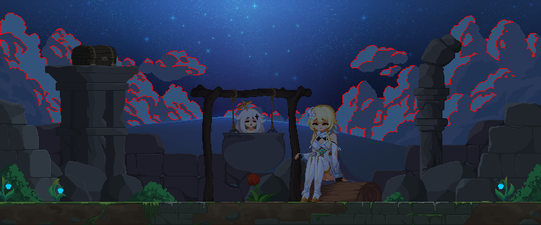
캐릭터와 배경의 기본 틀은 모두 잡힌 상태에서, 후처리 과정이 어떤식으로 진행되는지, 어떤 것을 중점적으로 봐야 하는지에 대해 알아봅시다.
// Let's find out how the post-processing works and what we should focus on, with both the character and the background in place.
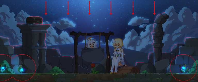
밤하늘의 은하수는 별다른 설명이 필요 없는 관계로(그냥 그리면 됩니다!) 구름부터 시작합니다.
구름의 가장 밝은 부분을 선택하고 (Select tool, W), 그라데이션 기능을 활용해 가장 광량이 많은 중앙 ~ 가장 적은 가장자리 순으로 색을 채워서 F9의 Blur로 마무리합니다.
// First of all, the Milky Way in the night sky needs no explanation (just draw it!) It starts with clouds.
Select the brightest part of the cloud (Select tool, W), and going to use the gradation function.
Fill with color from center to edge (the lower the luminous intensity as you go to edge) and finish with Blur of Convoluition(F9).

그리고, 광원의 방향에 따라 반사광, 환경광을 집어넣습니다. 어렵지 않습니다. 예쁘게 넣으려면 블러 기능을 적극적으로 활용 해 봅시다.
// And then, depending on the direction of the light source, we put in reflective light, environmental light. It's not hard. To make it pretty, let's take advantage of the Blur function.

다음은 중앙의 광원입니다. 바닥, 그리고 광원에 가까운 쪽에서부터 반사광을 넣어줍니다. 붉은색 광원이 바깥의 차가운 푸른색 광원과 대비되어 따듯하고 꽉 찬 느낌을 줍니다.
// Next is the light source in the center. Apply reflective light from the floor and near the light source. The red light source contrasts with the cold blue light source outside, giving it a warm and full feeling.
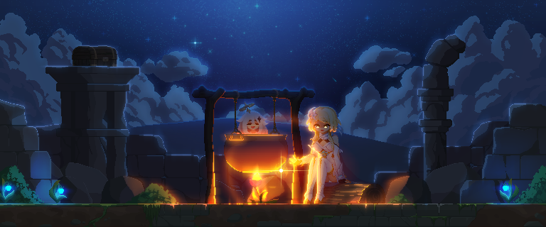
그리고 꽃에 점화하는 이펙트도 넣어줍니다. 타이밍에 맞춰 광량을 늘려주면 자연스럽게 연출할 수 있습니다.
// And add the lighting effect to the flower. If you increase the amount of light at the right time, you can make it look natural.

이펙트는 한번에 전부 그리려고 하지 말고, 순서대로 하나씩 필요한 파츠를 채워줍니다.
// The effect does not try to draw it all at once.
Fills in the required parts one by one.

별똥별 이펙트도 같습니다.
꼬리, 플레어 이펙트 순서대로 작업한 후 만든것을 필요에 따라 붙여넣어줍시다.
// The shooting star effect is the same.
Let's work on the tail and flare effect in order and paste them as needed.


이렇게 완성되었습니다. 비교해보면 굉장히 차이가 크지요?
제가 VFX와 post-process 작업을 매우 좋아하는 이유가 바로 이것 때문입니다.
물론, 이 작업을 건너 뛸 수 있도록 처음부터 예쁘게 그리는 방법도 있지만 저는 이런 식으로 그리는것을 더 선호합니다.
프레임 수나 컬러 제한도 크게 신경쓰지 않지요.
덕분에 용량이 많이 커지긴 하지만 딱히 상관 없다고 생각합니다.
// So that's how it's done. There's a big difference, right?
This is why I like VFX and post-process work very much.
Of course, there's a way to draw pretty from the beginning so that you can skip this, but I prefer to draw it this way.
I don't really care about the number of frames or the color limit.
다음은 이번 달의 마지막 작업물인 Sirin 작업의 마무리입니다. 11월에는 원신의 클레와, 커미션 작업들이 예정되어 있습니다.
// Next time is the end of this month's last work, the Sirin work.
In November, the commissions work and Klee of Gensin Impact are scheduled.
긴 글 읽어주셔서 감사합니다.
// Thank you for reading the long article.
추가 : 튜토리얼의 경우엔, 이것저것 생각하고 있지만 특별히 당장 무엇을 먼저 해야할 지 모르겠어서 보류하고 있습니다. 준비가 된 후에 간단한 VFX 테크닉부터 시작할 것 같네요.
// More: In the case of tutorials, I'm thinking about this and that, but I'm holding them off because I don't know what to do first. I think we'll start with a simple VFX technic when ready.
또한, 3개월 이상 구독한 장기 구독자분들에 대한 보상도 생각하고 있습니다. 곧 좋은 소식으로 뵙겠습니다. 감사합니다!
// Also, I'm considering rewards for long-term subscribers who have subscribed for more than three months. I'll see you soon with good news. Thank you!
Files
