Home
Home

 Artists
 Search
 Recent
 Random
 Posts
Posts
 DMs
DMs
 Tags
Tags
 Random
 Importer
 Import
 FAQ
FAQ
 Account
 Register
 Favorites
 Login
Login

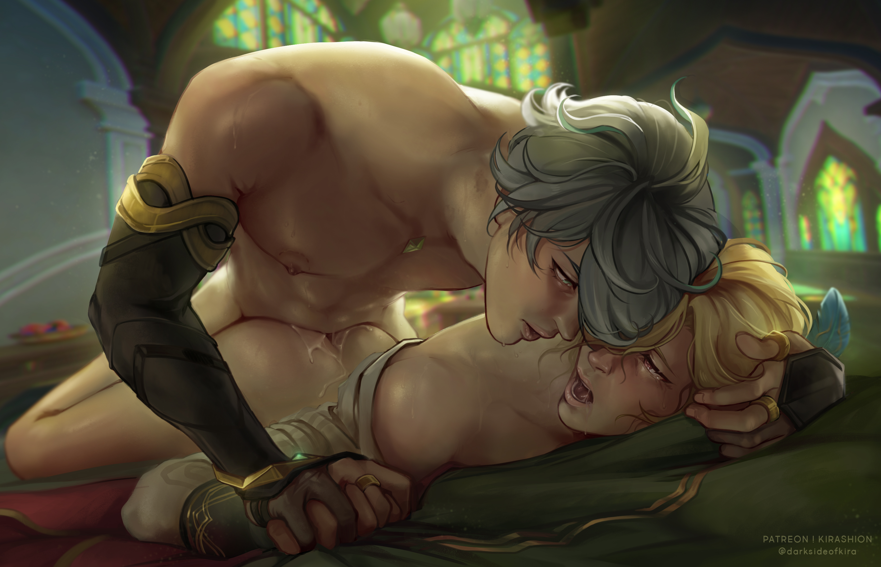
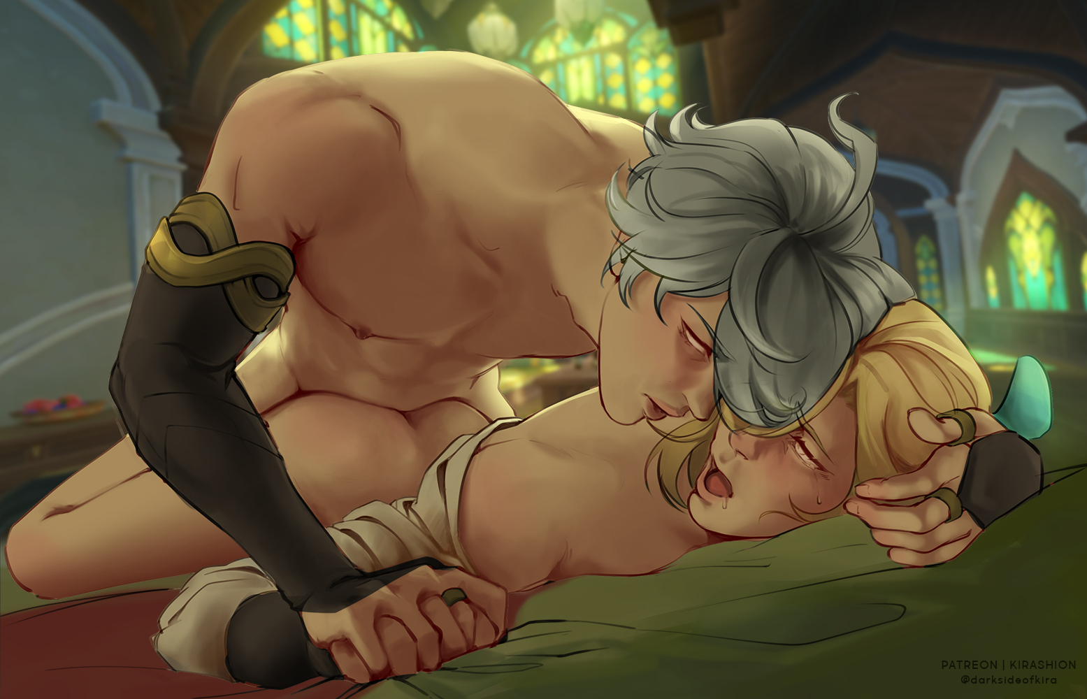
[ HaiKaveh ] Softly HD (+ process + PSD) (Patreon)
Downloads
Content
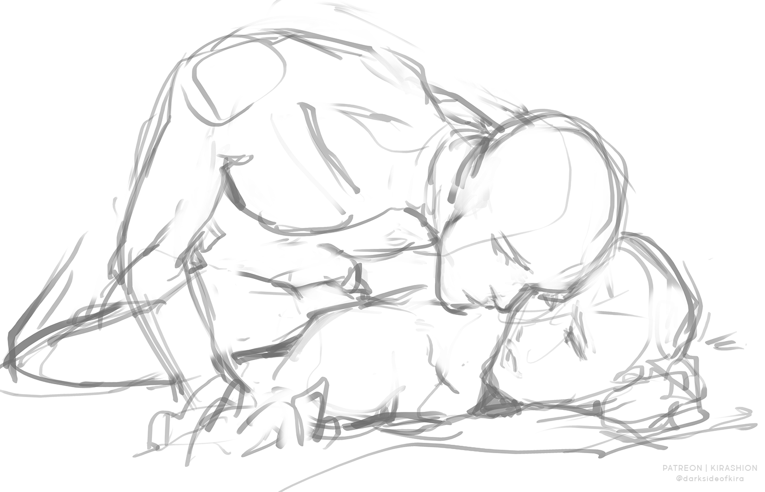
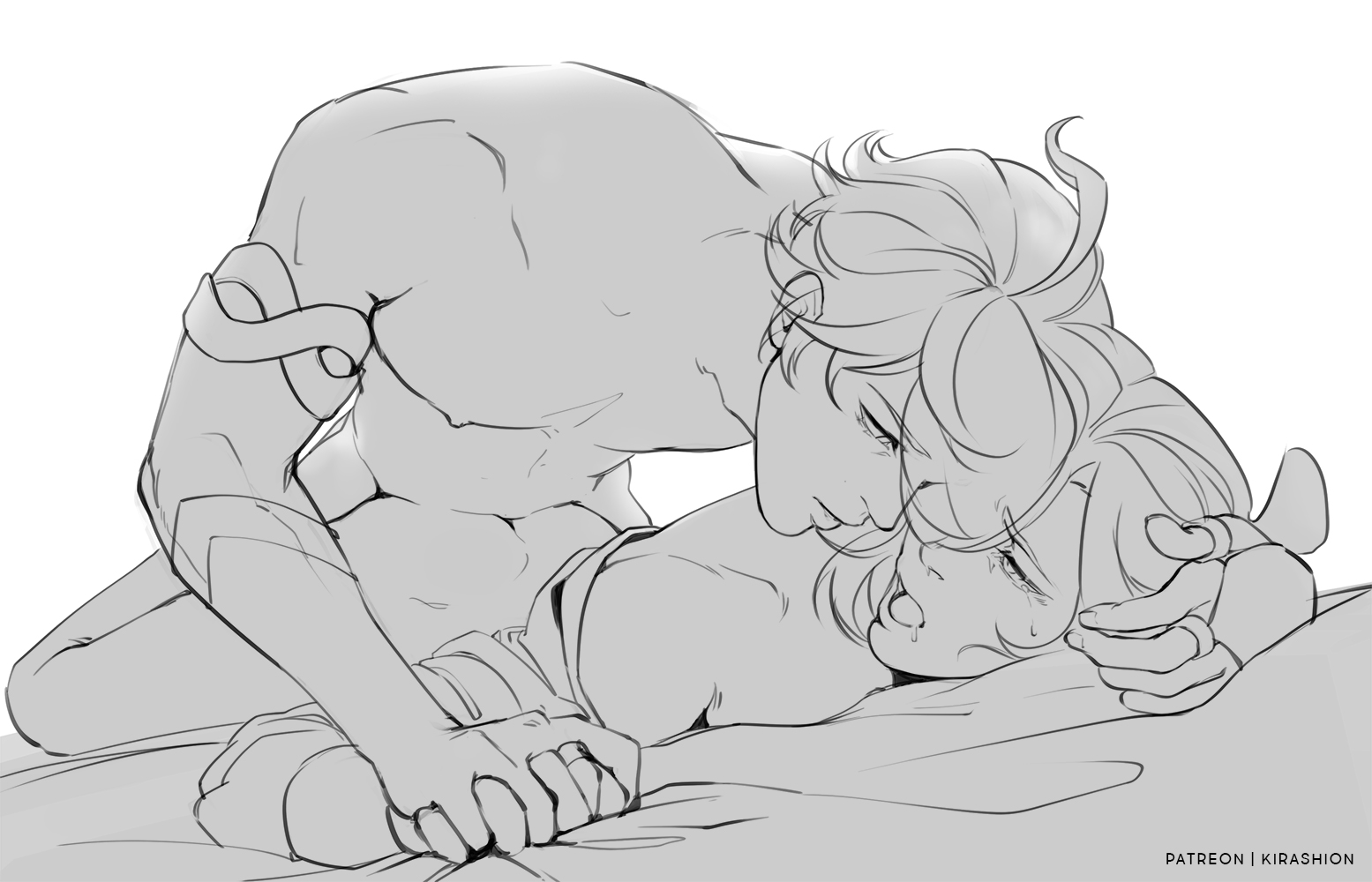
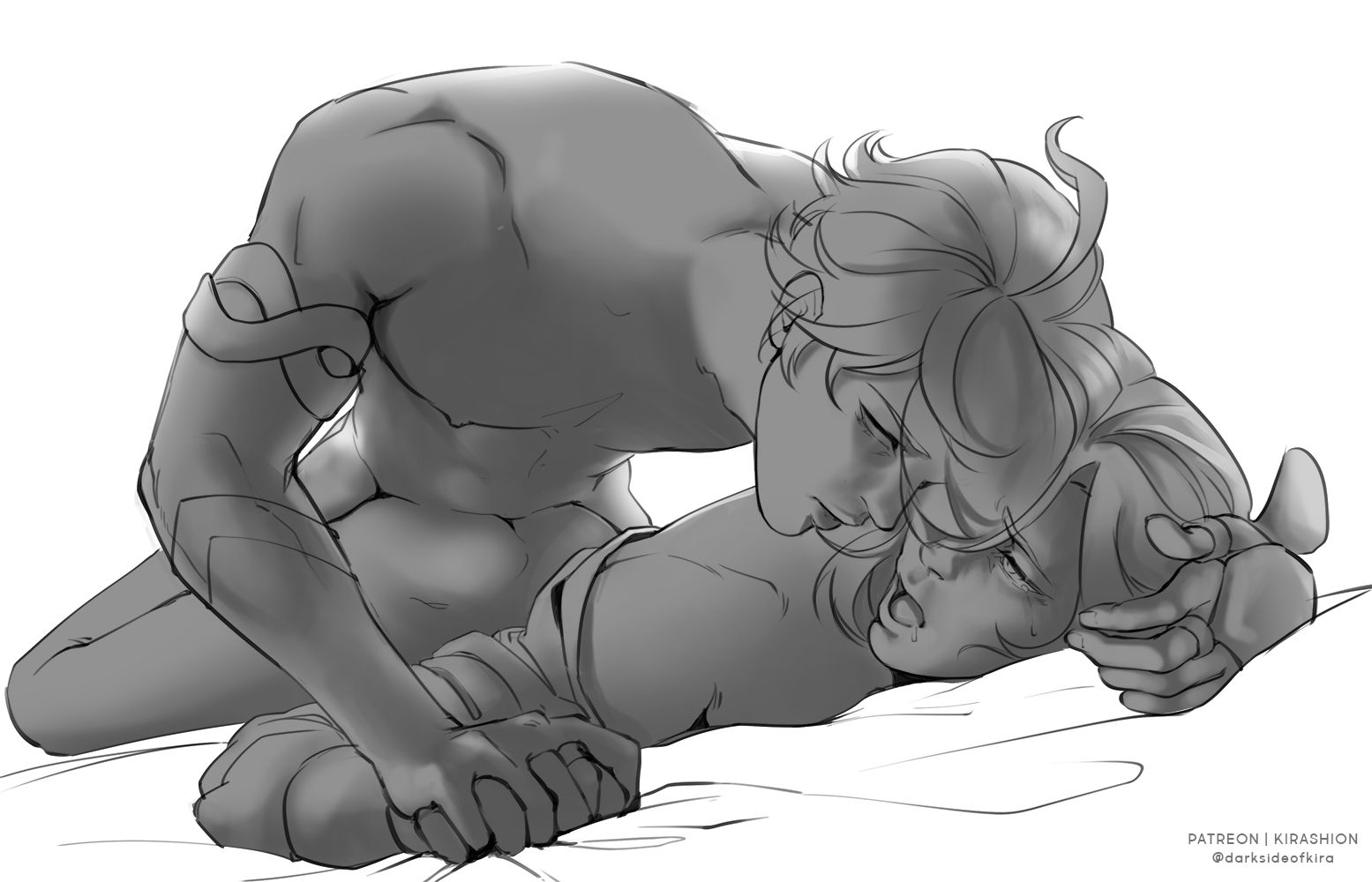
This is my second work using the colors on greyscale process! After the [ Baizhu ] Beyond Mortality HD (+ process + PSD) attempt I was curious to test it on a more complex piece and this is the one that ultimately made me fall in love with it!! I think from now on if I want to paint fully rendered pieces I'll use this process - it would be interesting to try it out with simpler color processed too 🤔 maybe detailing less the values layer, mhhh... you'll see me try stuff out I guess haha
There are some differences between this workflow and the Baizhu's one:
1) I spent more time rendering in greyscale. In the Baizhu piece, I had used the greyscale step only to set values, but the main rendering has been in colors... here, let's say 50/50. I can premise that on the [ CaeHeng ] illustration it's been 70/30 so eventually I can say the more you spend detailing/rendering in greyscale, the better!
2) I swapped greyscale/colors layers order and blending modes, as follows:
(BAIZHU)
Values layer/s set to Normal, 100% opacity
Color layer/s placed above Values and set to Hard Light, 100%
(HAIKAVEH)
Values layer/s set to Overlay, 100% opacity
Color layer/s placed under Values and set to Normal, 100%
The second solution is the one I went for the [ CaeHeng ] illustration too, and the one I prefer!
Feel free to ask anything if you have questions on this process! I'll try to record/stream the process next time I work on something like this!
💌 HD + PSD in attachments!
Files