Home
Home

 Artists
 Search
 Recent
 Random
 Posts
Posts
 DMs
DMs
 Tags
Tags
 Random
 Importer
 Import
 FAQ
FAQ
 Account
 Register
 Favorites
 Login
Login

[ ZhongChizhu ] A Lantern for a Wish 🏮 HD (+ making of) (Patreon)
Downloads
Content
Because I consider it one of my very inspired and maybe most effective works (yes I'm very biased because it's my OT3), I'd like to show you the process of my latest comic! I don't usually show it because it's even simpler than illustrations, but thought you might be interest for once!
✧ Ideation and sketch
Inspiration came during this Lantern Rite, which is my favorite event, and after watching a Bilibili fan animation (starts at 1:56:00 of the streaming) for Chinese New Year! The fan animation shows amazing redesigns for nearly all Genshin characters, but I fell in love with Baizhu and Zhongli's designs in particular!
I basically wanted to put my favorite things together:
⇾ Lantern Rite + ZhongChizhu (ft. Zhongzhu new outfits)
When the prompt came to my mind, I wrote a note on my phone:
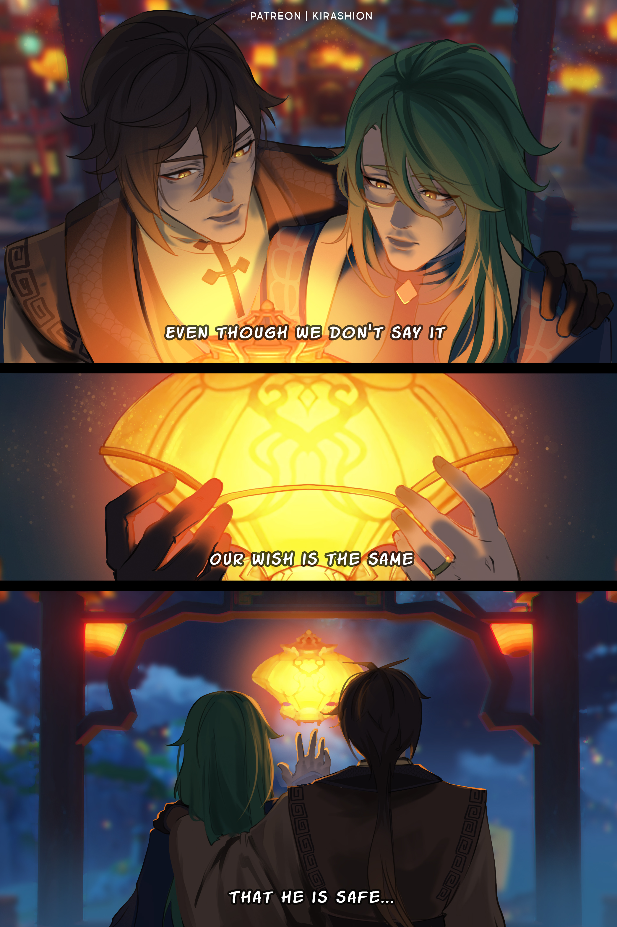
⇾ Zhongzhu release a lantern. "Even though we don't say it, I know our wish is the same" / "That he is safe, and may he come back home soon"
After a couple warm-ups, I sketched the layout:

✧ Refining the idea
I knew that Childe was not in Liyue, but I wanted him to be able to see the Lanterns. I talked to Patrons on Discord about my ideas...

...and they came back with a better one! Myr suggested Childe was not in Inazuma, but coming back from Inazuma!!
It immediately became my favorite scenario, but I wanted to try the n. 1 as well because it was my initial option, so I quickly put together the screenshots I had taken to see how page 2 would look in both versions:

At this point for a second I liked the mountains options better because the sky looked more colorful but:
► I still liked the concept of Childe coming back from Inazuma more, since it's where we saw him last time;
► I knew I could make the sky just as colorful over the sea, it just needed more work;
► Discord Patrons also voted for the boat option!
So, eventually, this became the final draft:

✧ From sketch to final
At this point, you want to refine everything... by re-doing it.
First, I cleared the background images from the filters I had tested on them. I find a clean start always better than the "fix what you already have" option, especially at early stages.

▲ Before
▼ After

The transformation focused on:
⇒ Darkening the colors so that it looked like night with no doubt; the 2nd page screenshots, in particular, were too light.
HOW?
I use a special Photoshop Adjustment called "Color Lookup"
Image > Adjustments > Color Lookup
It allows you to load pre-existing filters which alter single colors in different ways with the intent of changing the image's atmosphere. The one I've used here is called NightFromDay.CUBE and it's used to darken the atmosphere in a photo taken by day so it looks like it had been taken at night time (pretty cool!).
As far as I know, no other software has this option (please correct me if I'm wrong) but there's a browser version of Photoshop (yes, you read it right) named Photopea that has the Color Lookup tool! In Photopea you can upload and edit different files extensions, so you can try out the tool on your drawings!
⇒ Make lanterns very bright so they could stand out in the (now darkened) night sky!
HOW?
I chose Lineart Dodge (Add) as blending mode for the lights layers
Choose the blending mode from your layer's settings (any software)
2x Linear Dodge (Add) layers for the lanterns light trail
1x Linear Dodge (Add) layer for small lanterns
1x Linear Dodge (Add) layer for bigger lanterns + Outer Glow (Linear Dodge (Add) mode)
Remember, you want a VERY bright and saturated color to begin with!
⇒ Blur the furthest parts of the background in order to make the characters stand out.
HOW?
Apply "blur" filter to the selection
As simple as that! .。.:*
Once the atmosphere is set, the rest comes easier! At this stage, "only" the characters are missing so all I had to do were the lineart and coloring...

▲ Before
▼ After

For lights and shadows, I once again used the methods explained above:
⇒ SHADOWS: NightFromDay.CUBE Color Lookup filter
⇒ LIGHTS: a very bright orange on a Linear Dodge (Add Layer)
TRICK!
When you work on a layer of which blending mode is not Normal, it gets hard to color on it. You might want to color pick often, but the wrong eyedropper settings would get the wrong colors (because the blending mode is altering the colors)...
Instead, use a Layer Mask!
Fill the whole layer in the chosen light color, then apply a Layer Mask. You'll notice a white thumbnail appearing beside your layer, click on it in order to paint and edit your Layer Mask, just remember:
→ where the Mask is WHITE, the layer to which the Layer Mask is attached is showing
→ paint it BLACK, and in those areas the layer is no longer visible.
You can instantly de/activate layer masks to see the before/after as well easily edit them anytime!
And done! ✨
I hope you enjoyed the comic!
💌 HD + PSDs in attachments!
Files