Home Artists Posts Import Register

Content

Hey guys!

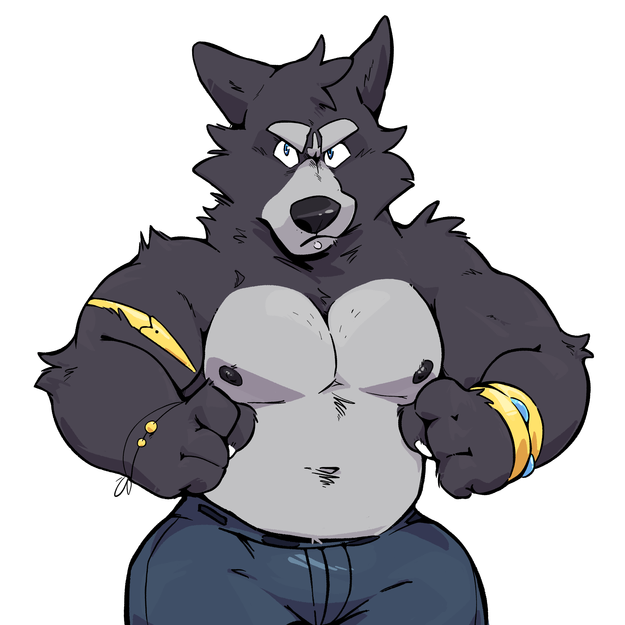
So Haps has been hard at work on a new sprite set for Amicus. Some of the main reasons being that he wanted to work with a higher resolution to detail the sprites more, bulk Amicus up a bit, and also better match the sprites with Amicus's look in the CGs.

These sprites will be used at some point for...something else, but we could also implement them into Adastra if you guys would like that.

I understand that changing sprite art when a project is so deep into development can be controversial, so this is more of a test to see what you guys think first before we make any decisions.

To figure that out, below are links to a version of the game with the new sprites implemented, clothed ones only though, so when Amicus isn't fully clothed it will default back to the original sprites. This might help you compare and decide better.

I have also attached several examples of Amicus in different stages of undress so you can get a better look at his build. Be warned that several of these are NSFW.

Once you've decided, please select the version you like best in the poll! Keep in mind that this poll is mainly just to get an initial reaction and won't necessarily determine for sure whether or not the sprites are used.

WIN: https://www.mediafire.com/file/9aytptww064kz04/Adastra-12-1-win.zip/file

MAC: https://www.mediafire.com/file/35fahw64pkqzbc9/Adastra-12-1-mac.zip/file

Linux: https://www.mediafire.com/file/null/Adastra-12-1-linux.tar.bz2/file

Files

Comments

Anonymous

oh my god these new sprites are amazing!

Anonymous

Deffffinitely the new ones!

Anonymous

New ones are great! Love em!

Anonymous

A lot of positives to the new sprites, the only negatives I would say is that he looks less confident in the facial expressions, his head seems a bit more vertically squished than before, and a decrease in overall line detail. Just my 2 cents.

Anonymous

Damn, these new ones are incredible. It will be weird adjusting to them at first, but that is hardly a problem. I will say that he looks a little less intimidating in his angry sprite now, but overall I think that this is an improvement.

Shutter

I just can't help but feel there's something... odd about the face shape in some of the new sprites. He's like... wonky? I think I like the old ones a lot more but I guess I'm in the minority there, which kind of surprises me.

Anonymous

I can't shake the feeling that the new sprites has Amicus' eyes a bit too close and resembles Virginia a lot more now than he used to. That and being used to the way Amicus already looks, I prefer the old sprites myself.

Jeremy Hybrid

I like the new sprites. They all look cute and more lively (in my opinion)

pandalily20

I love them omg they look sooo good

Anonymous

Honestly Amicus feels slimmer in the new sprites if the intention was to bulk him up. His trap muscles and pecs aren't as pronounced anymore. His build doesn't seem as full to me in the new sprites. I think his accessories all being larger now also add to him feeling a bit smaller I don't think the new sprites are bad, mind you. I just think the old ones convey his size and weight better

Anonymous

Something about his eyes look a bit more feminine. Someone else mentioned a similarity to Virginia so I must be getting something similar. Bigger chest, maybe slightly bigger hips. You can see a bit of a difference between Amicus and the other characters, but I doubt it's all that distracting or noticeable. There's really not a wrong answer here in my opinion. I might prefer the old ones because that's what I'm used to I guess.

Anonymous

The new sprites I think are overall for the better, the ONLY thing is that because of the new eyes/face changes, it makes it a bit harder for him to pull off being angry/mean. I think the old sprites do those expressions better, while the new sprites do his general friendly/flustered expressions better. The notable one for me that the old sprite is better is his disappointed expression. Other than that critique the new sprites are undeniably higher quality and richer, which is very cool!

Anonymous

I like the new proportions on the body, and is it just me or does the fur look more...well more. What i dont like is the head, the neck looks a bit too long, ears as well. And the overall muzzle look looks too pointy, eyes feminine. Which lends itself to be good with scared and flustered looks, but nutral and angry looks much worse. He looks more silly, which you dont need more of that for amicus as he is hard to take seriously as is

Anonymous

My main issue are the eyes, though it might just be because I'm used to the older sprites' larger eyes. The eyes on the new sprites just feel tiny for his face. And also his mouth on some sprites like he's happy sprites. Otherwise the new sprites look great, a lot of them read a lot less stiff which isn't something I noticed until I started comparing them.

Arid

New amicus looks cute! I really like him! So sweet :3. And on a lot of the sprites the higher resolution is really evident. Looks so pretty!

Anonymous

His eyes look like they could maybe be a little bigger, imo. Also, his thighs are really wide which seems really off.

Anonymous

scratch that, the eyes look mostly fine. don't see too much reason to change them. The thighs still are too wide

Anonymous

I never comment on anything, but I feel more inclined to right now because of hoe big of a decision this is. The art style itself isn't bad, just kinda...wonky? His hips are way to big, his neck is kinda weirdly shaped and angled interestingly, and he almost looks bloated(?) when standing next to others. His face also looks really bloated. I LOVE the old sprites, and honestly think they're the some of the most well-crafted sprites in any vn game out there. I don't see any reason to change them, but it seems like I'm in the minority here.

Anonymous

I honestly like old Amicus' sprites more, old ones look tough and manly, and with right amount of wolf dad bod...

Anonymous

Upon looking again, I think the biggest issues are with the ones where he's clothed. The neck and hips are just weird, and his eyes are really small.

Anonymous

I really hope you'll leave old sprites as they are or even give them a just a little touch

Anonymous

It took a lot of thinking, but I definitely feel that these new sprites are a good move, lots of advantages to them. The feedback should be taken into account, and I'll miss the old ones, but I'm excited for the prospect of playing through the rest of the story with Amicus' new look!

Anonymous

Between the newer and the older sprites, I'm more fond of the newer ones. They're just more lively and honestly feel more fitting for Amicus's friendly/open character. I think the only thing that may be an issue is that he doesn't look nearly as angry as he used to be. A weird thing to point out, I know, but it does make the more tense points in the game feel less tense. The music and writing does make up for it though, so it's not too much of an issue.

Anonymous

Overall I would prefer the new ones myself. Not like the old ones aren't pure treasure, it's just that these are as good if not better once you get used to them. I like that his face looks more like virginias. They are brother and sister, so makes sense that you can see it. Just, please, make the hips smaler. Could just be me, but the moment I noticed that it just became so irritating. Especially the 4th one and the onces with pants. The other onces seem totally fine in my eyes and I feel like the 2th one is perfect. (Also, the last one is a pouty face and you can't unsee it now.)

Anonymous

I prefer the old sprites. To me it looks like the new sprites have a more round, organic approach. While I do appreciate the new detail, I liked the angular look to the old ones more. The shape of his face, neck, and eyes seem to hit me the most and feel more feminine, especially the eyes. The new expressions don't seem to have as much impact. One of them he hides his face a little too much. And the victory pose, fist in the air, doesn't feel as victorious. There's much less energy in it. Overall, I prefer the older sprites, because they felt more masculine.

LLVPandaSevron

I'm sorry but I really am not a big fan. For one you say the reason is to bulk him up but it REALLY slims him down way too much, especially around the waist. I also didn't like the promo public one for 12 for the same reason. Another is, the shape he has, it fits his characteristics as a person better. He's playful...easy going...and kinda jolly in a sense, I kinda see him as one of those larger emperors. Especially when he starts scarfing down Alex's grapes. Those would have made better sense to see while he was locked up and not eating as well, which is a third point, we've seen the kind of glutton he is when he packs his late night snack. Also it was a refreshing design choice as people, artists, tended to swing either to a bulky meat body shape or a thinner and lean shape, sometimes just small, or thick and rotund but the original design was something new. It was bulky and nice to see, not out of shape or misshapen, but fit and sensible. I'm sorry but so late in development is a harsh time to change something so base and prominent...add it to your little secret future project you like hinting at by all means, but after having the current build so far has become stronger than familiar. At least with a new Adastra project (whatever it is) would be a more ideal moment to change the sprite rather than so far into development and close to the end. A great example would be like how movies change design before the movie comes out (ex. Sonic) they make changes before development is finished and most importantly...before the fans get used to/familiar with the current design. Personally, I've fallen in love with the current design, after playing it for so long, going through the storyline, the ups and down, the hardships, I've built a bond with what I've seen and awaiting new updates I look forward to seeing Amicus again. But to be met by something so very different, for some that's soul crushing. 😔

afoxbutt

I like the new ones, but they don't really fit with the other character's sprites I think.

Anonymous

I'm super torn on this. There are some details on the new sprites that I like, but his old ones he looks far more masculine and assertive, don't forget confident too. This new one he looks a little fatter to me and a tad bit more feminine. Maybe instead of changing the whole thing you could just borrow some details from the new sprite? In the end its your game and you should decide. I suppose I should have known that there would be a chancce at chainging the sprite art style when I jumped in early on this game. I think I'm just more in favor of the original style because that's what I been use to seeing. Whichever direction you take this I will gladly follow. I just ask you to do Amicus and all the characters justice if you change their appearance. Because doing so also changes who they are to some extinct.

Artie

This is my first time commenting as a patron and I'd say that some sprites are better, but others (while still good) can use some improvement. I was thinking maybe we should vote on the individual sprites to see which ones need improvements and which ones are good already for implementation into the game?

LLVPandaSevron

I won't deny that the new design isn't crisp and well made, especially the fur, it's so well designed and draws huge amounts of attention. Literally the first picture, the one I clicked first, my eyes were immediate drawn to his shoulders and arms...to the fur. But as I took in the rest of him I started, well you lost me. The biggest issue why I'm not a fan is the shape and proportions given to Amicus as they just seem wrong for such a large fellow. Honestly, if you were to take the crisp looking fur, maybe facial expressions off these new designs too (some are really good), and the poses, then add them to the bulkier and meatier original design you'd have something AMAZING that I personally wouldn't be able to look away from 🥰🥰🥰

Anonymous

These new sprites look quite nice! But I'm willing to agree with a bunch of the others here in the comments. I think the hips/thighs are way too big and exaggerated, I prefer him looking much more masculine like in the old sprites. I think if you could manage a nice middle ground between the expressiveness of these sprites and the masculinity of the old sprites it'd be perfect. Thanks for all the hard work!

PEACEWOLF

While I do like the new sprites, I also believe the thighs/hips should me more muscular and the eyes in his idle smile sprites look a bit too feminine to me. Overall though, they look good. Especially the T H I C C bonus butt sprite. Let's have that whenever possible please. >_>'

Tore91

I definitely prefer the old sprites. The new one is a lot cute, but the older are... majestic

Sashido Zerako

tough call for me I like both for there own styles so hard to pick I gotten so use to the old version but the new one has a great look to it as well x3 also bonus haha I do feel that yeah the idle smile does have feminine look to them

Lorag

I definitely prefer the old sprites. The new hardly look like Amicus in my opinion. Amicus used to look firm but friendly but in this version he just looks like a caricature of himself. Just too goofy. I definitely think it would be more productive to make sprites for extra characters or more sprites for different actions. I also think that the attempt to make him "bulkier" failed hard. Some body parts look slim, while other parts look outright obese. And the pictures that show him from side are uncanny valley material. I normally LOVE Haps' work, but this is just not up to his normal standard. Right now the New sprites lead in the poll by a hundred votes, but despite that I seriously hope you reconsider.

Snow Kruzer

As much as I love the old ones, which made me love amicus so much, it's the artist choices that matter in a way. It's how he sees Amicus, and so it should be how he is. Even though my vote is for the old ones, it's haps' and your choice to replace the sprites ^^

Kaiderg

It's weird cause honestly both fit him very well but for different reasons. The old sprites work well when its unknown whether Amicus is someone to be trusted or not, or when the protag is cautious around him The new ones work well when Amicus is friendly and caring to the protag in the second half of the story, kinda of like the way he's seen changes Both are very good and have advantages and disadvantages, if consistency is preferred then maybe the new ones are the way to go!

Anonymous

There are definitely things that I like in new sprites but as of right now I think old one fits more better, with more redesigns would prefer new ones though.

Anonymous

So after playing some of the test build and sleeping on it, I've come to agree with some of the other comments here. A bunch of the sprites are clear improvements, like his happy sprites and his crying one, as well as his disappointed and blushing ones. However, I will say that some others make him look less masculine. He looks shorter now, which I think is due to the thicker thighs, and the only sprites that make him look noticeably bulkier are the ones where he is in profile, like his happy ones. Honestly, my biggest criticism is that his angry sprite makes him look more pouty than angry, which I attribute to his posture (plus his eyes are a little too close in this sprite imo). Despite my reservations about some of them, they are all quality work and well made, and I really like more than I dislike. And that "bonus" one from behind is perfect in every way.

Anonymous

I would keep the old sprites. Amicus looks more masculine and trustworthy in them. New ones make him look too goofy. Although the new ones also have some details that I really liked. How about blending them into a new set of sprites in which you keep the best of each version?

Anonymous

I feel like to properly compare the two sprites we should see a higher resolution of the original.

Anonymous

I could beg you guys to keep the old ones, he looks much more masculine and confident. I do love the detail on the new ones but as some others say, the thighs/hips are way disproportionate for a man in my opinion looks more feminine and kinda more fat than muscular. We all are going to love Amicus no matter Im sure, but thanks guys for caring about our opinions, you guys have done an amazing job till now and I completely trust your judgment. Thanks you all for your hard work!!

Anonymous

I only beg for a middle ground if changes are made. Fix the thighs and hips at least and keep him as masculine as possible.

Anonymous

I like the old and new ones. But if i had to decide i would take the old ones.

Anonymous

Still prefer the old ones. New sprites look a bit wacky and his eyes looks feminine-ish.

korppuhiiri

honestly, i'm finding it really hard to pick which i prefer! if i had to choose, i think i'd go with the old ones, but maybe that's just because i'm used to them?

Anonymous

I love the new sprites! They look more cartoony. They remind me of the current style of drawing of the Cartoon Network's series as Steven Universe, We Bare Bears, Gumbal... more roundish, in general. I prefer the new version, it's more "family-friendly" and less thirsty, at least in my opinion. What I don't like it's the penis... it seems bigger to me, more detailed, and that is an odd choice because it doesnt fit the new version... But I love both versions. They are super great, keep up the good work.

Anonymous

I like them both, except the new ones make him appear overweight/dad bod which isn’t what he seems to be described as in the VN. Still like Haps style though.

Anonymous

I really prefer the old sprites, especially after going through this much of the story now. It's kinda sad and weird for me to have seen him a certain way after sharing so many of these deep moments, and then have to readjust the way I'm seeing a character that I've already really grown to love. I'm also biased though because I'm days away from getting a whole tattoo of him of his old sprite.

Anonymous

I love these new sprites! They're supper consistent to the CGs

Anonymous

The more I look at the new art the more I like it, but again the hips and thighs should be more masculine.

Anonymous

I like both. : 3 Its the final decision of the team if they are using the new sprites or not. I will love the "game" with the old or the new sprites. Good job, keep going.

Anonymous

My only problem with some of the new sprites are his eyes, idk you guys but for me some of them look too small(2UNDIES) or too feminine(3rd "1NUDE"). BUT IM IN LOVE WITH the first "1NUDE" and Bonus!!!!!!!!!!!!!!

marshalwoofs

I gotta be honest I absolutely abore both of them!! I dunno, maybe make an option to use either or in the novel. Just a thought!

Anonymous

I really, truly, love most of the new sprites but I have to admit some of them have their "eh" moments. As many people have noted, Amicus' eyes in his neutral positions have a very feminine flair to them, and his hips seem very large relative to his shoulders, making his waist actually seem slimmer overall. Other than that, I really think the new sprites are amazing and I hope Haps doesn't take any of these criticisms to heart. The nude sprites are great and the side/profile ones are literally so perfect I wouldn't ever dream of touching them. Overall I love love love the effort and obvious passion that went into making these so I hope Haps feels proud of the work he's done. ❤️

Anonymous

Agreed, changing the eyes a bit and slimming the hips/thighs would fix most everything, honestly. Though, the sprites without the leather pants seem fine so I think it is just the way he drew the pants that makes the thighs look bigger. And the side/profile sprites really are perfect. Not gonna lie though, I do miss his necklace in these new sprites.

Anonymous

artist is super talented! I like the old ones tho

Anonymous

Could we have a possible compromise and make it so both the original sprites and the new sprites are interchangeable thorough the options menu? Like I see no reason why you should discard the original sprites at all. I'm sorry I seem upset, but it just seems really unfair to do this so far into the development. I am aware my opinion on this doesn't matter much given that the majority seem to like the new style better, and I don't deny that it is good. Minus a few details like the eyes and thighs/hips. I just don't see the point of replacing an already perfect art style. I doubt this will be available but I just thought I should say it in hopes you will respond or just acknowledge it. Could you not just improve the original, make some more expressions and keep it as a separate skin for the game and let people who grew to love Amicus and the others in their original wolven glory?

Anonymous

I have to join the club of people who prefer the old sprites honestly. The new ones simply aren't doing it for me. His face looks feminine in the majority of expressions. His eyes are... wrong to me. I see no reason to change his face so much because that's basically a new character once you change the face. The upper body is improved I guess, I've no issues there. The hips though, Kim K would be jealous I'm sure. I don't know. Maybe it's because I'm used to the OG Amicus that I simply don't see this one as 'my' wolf. Like I said earlier, the face isn't doing it for me. He's no longer manly and I know the point of this was to make him more bulky but he now looks chubby in the face. Heck, he just looks overweight all together. I've no issue with that of course but that's not how Amicus is described at all during the story. If you do however decide to go with the new sprites at least allow us to have an option in game to choose which ones we'd like to use (at least for this project). I think the ending of this story would be completely ruined for me if suddenly at the end I am forced to use the new sprites that are not doing it for me. I'm aware that in the poll the new sprites are winning, but there are enough of us who prefer the old ones so please listen to the feedback of your fans. At least give us an option to choose in game...

Anonymous

Just went through the attached images in the post and here's my personal opinion on them: 3PANTS.png -> He looks so so overweight here it's just comical 2UNDIES.png -> Everything is improved here but the face 4ALL.png -> I'm so sorry but this looks like a fan art/caricature 1NUDE.png (blushing) -> That one is perfect actually, that's Amicus in my opinion 1NUDE.png (front) -> Body, perfect. The face, that looks like a female wolf face to me Bonus.png -> Perfect, manly pose, perfect propotions. Not sure why we see pink in his mounth from that angle but not an issue

Anonymous

I'd probably say the older sprites. Not a fan of the new-style face, tbh.

Anonymous

The nude sprites look great but the clothed sprites look like they were rushed(?) and not quite right. Otherwise I'd be all for it.

Anonymous

New sprites are way more defined and I can see the work Haps put into them. But they have a different "feel to them". They're soft in a way, the original sprites roughness was somewhat better for me. But that's more personal. If anything, also the ever so slight changes in body proportions make things a little off for me. As other people mentioned his eyes seem feminine in a few sprites and eyes are really important for a character. Improve upon their shape and their color, which should be a deeper/darker blue. Slight change for the eyes would improve a lot for the new sprites. Additionaly, perhaps tiny changes in proportion and shape of his muzzle. In a few sprites his chin seems a touch too big and looks too round because of it, it needs slightly more definition as well. I think that's all I can think off honestly. Kudos to Haps for his awesome work so far but if i have to choose between old and new sprites.. i cant decide. Consistency of art needs to be achieved but the "feel" of old sprites is better for me.

Anonymous

I adore both, love these new sprites slightly more for how fluent they are with CGs. It makes me feel much closer to the story and Amicus personally. The style suits his bubbly, excitable, and inquisitive personality a lot more - a lot of his speech is represented better by these new sprites. A bold move, and I definitely think it'll pay off.

Anonymous

I really like new sprites. I do think that new Amicus doesn’t look like he could go toe-to-toe with Cato, while Old Amicus looks a bit less soft, and more fit than the old wolf. Additionally, he needs to have an angry sprite. I’m reminded of the old CGs between him and Neferu and he can pull off a good angry face in those, that I don’t see here. It feels incongruous in that sense. I’m not all that bothered by him getting a new body type. He looks more endomorph than mesomorph now, but I can see why some people might not like that.

Anonymous

An idea that came to me is maybe just redrawing the old sprites 👀👀They look great even though i would love to see them redrawn. This is such a late comment oof😔👀👀Also the new sprites would be great as well 👀👀👀Im fine with either one

Anonymous

While I adore the new sprites (especially his expressions) I feel like they shouldn't be implemented in Adastra. My biggest gripe is that the art style of his sprite looks out of place next to the because it's an evolved form of Haps's art style (with toonier shapes and thicker lines). It's not that these stylistic changes are inherently bad, it's just that it doesn't fit in with the look of the other characters.

Anonymous

I just remember Amicus in the ship at the beginning

WinterFloof

In terms of quality, the new sprites are a definite upgrade, that being said however it gives off a completely different vibe. How Amicus looks will be the first impression people get when they first see him. He does now have traits that are commonly seen as feminine but I don't think that's entirely out of his character (He wears lavender perfume or something along the lines) I like his new thinking sprite in particular, in his old sprite he looked as if he didn't care and was just dazing off into space (no pun intended) I vote on the new sprites, though I'd have to agree with some that if Amicus gets new sprites the other would have to as well so there isn't any art style mismatch. Can't wait to see more Adastra!

Anonymous

New sprites are amazing! Definitely go with those, Amicus looks Adorable!

Anonymous

OMG!!!!I love amicus so much and I hope New Sprites will be approved soon!!!

Anonymous

After carefully looking at the sprites, I saw that most of the new ones look way too feminine, especially his eyes and how Amicus is written. Some of the naked ones look really good and after comparing them to the older ones, I think the only reason I like them is because they just look like slightly more detailed versions of the older ones.

Anonymous

Both are wonderful. My favorite of the sample pics is the 'Bonus' pic. I am a stickler for consistency so since the 'Bonus' pic is in the new set then I would ultimately chose that one. Amicus definitely needs to come off as fit as opposed to soft, however. Beautiful work all around guys. Go with your gut. You are the creators after all!