Home
Home

 Artists
 Search
 Recent
 Random
 Posts
Posts
 DMs
DMs
 Tags
Tags
 Random
 Importer
 Import
 FAQ
FAQ
 Account
 Register
 Favorites
 Login
Login

September Update Part One (Patreon)
Published:
2020-10-01 00:55:26
Imported:
Content
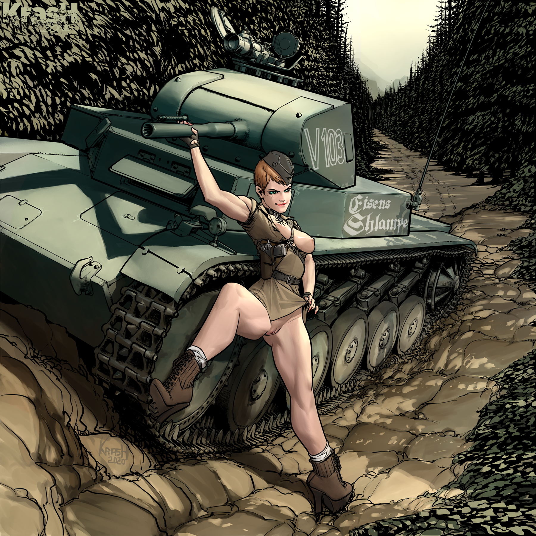
Hi! The main image deserves a bit of explanation - it's the client's homage to one of his favorite animes - Girls und Panzer, that's why the mix in the iconography.
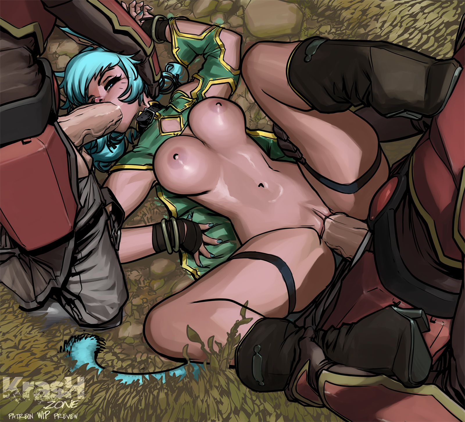
The Zegan and Angelise is a great example of something I keep telling Kras, that some images don't need THAT much of refining - of course more refining is great, but sometimes the image is perfect in the deliver of the message (the lineart) and the mood (the colors) that more definition is a bit redundant. But what YOU think?
Cheers!
Fabs
Files