 Home
Home

 Artists
 Search
 Recent
 Random
 Posts
Posts
 DMs
DMs
 Tags
Tags
 Random
 Importer
 Import
 FAQ
FAQ
 Account
 Register
 Favorites
 Login
Login

PixelArt production record "snow station"(3/6) (Patreon)
Content
"PixelArt production record 01". This is a $4 article on shopify.
But we will translate it into English and publish it in 6 articles on patreon. This is a patron benefit.
I will be posting the first chapter, "Until I Started Drawing Pixel Paintings.
This is a readable The technical discussion begins at part 3/6.
Reason: English translation takes time. Patron benefit is needed. I do not yet have a standard to distinguish patrons by amount, etc.
Previous : PixelArt production record "snow station"(2/6)
Next : (untranslated)
---
2. Let's Draw a Pixel Art
The above image is a lower resolution version of the rough drawn in "1. How I came to draw this". I brought it home, so I will start drawing in earnest. From here on, the main content will be technical.
About Save Formats of Pixel Art
Unless for any particular reason, I recommend GIF as a save format for images, including rough. Not only can GIF be animated, but it also has an "indexed color" function that manages colors in a palette.
You can convert images created in PNG or JPG to GIF with some conversion tools, online converters, GIF-compatible painting software, etc. I use LICEcap, a GIF screenshot tool for Windows. Unlike PNG and JPG, GIF has an upper limit of 256 colors, so please be aware that conversion reduces colors.
Scaling "No Interpolation" in Principle
To avoid the image being blurred by interpolating, select an interpolation method such as "Nearest Neighbor Interpolation" or "No Interpolation" when lowering the resolution of the original image. Changing the resolution of pixel art, especially reduction, is rarely used, but it's convenient when you want to make up pixel art feeling at a draft stage and use it as a base.
Let's Organize the Palette
Functions "Integrate Duplicate Colors" and "Delete Unused Colors" of EDGE2 can erase unnecessary colors briefly. Other editors may have similar functionality.

Sorting by "Brightness Order" reveals almost indistinguishable and unused colors. If they seem meaningless, it's OK to delete them now, even if they didn’t disappear by "Integrate Duplicate Colors" and "Delete Unused Colors." This tidy-up is an excellent mini-game for breaks. The following is a state of play.

How to Create Colors
I often create a new color from an existing color. Choose one close to what I want, copy and paste it into an adjacent cell, and manipulate the slider. The GIF below is just a demonstration, so I don't create it all at once indeed. I do this when starting from the existing colors is quicker, such as faded colors by aerial perspective or shadow colors.

When I draw only this method, strange slime mold organisms appear on the palette.

Grasp at a Unit Level
I will gradually raise the overall completion level and bring it to "moderate finish pixel art. " So far, the whole is Lv1. It's fun to think of each motif, such as Train Lv1 or Person Lv2, like a unit in a tower defense game. I will explain each Lv.

Lv1: A rough drawing showing existence. At least recognizable as what it is.
Lv2: Composition is present, and the placement of details and proportions are well balanced.
Lv3: Each pixel has a meaning. A finished work you want to show.
2-1 Train Lv2, Person Lv2

Increase Density
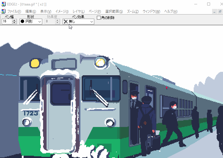
I've raised both Train and Person to Lv2 with momentum. I spent most of the working time on the train. I adjusted the position and size of each part, referring to the photo and my memory, and painted the colors properly. I draw what I need without worrying whether it's poorly. I keep what I drew once, even if it happened to be. Those are my property.
EDGE2 has a "Tone Toolbar" useful for quickly creating meshes. I feel anxious when the whole screen is not filled, so I hurry to add the amount of information by emphasizing the edges of the windows darkly or simply increasing the pixelated impression with meshes. Since it’s difficult for the "Filling Tool" to pass through the mesh area, I recommend you cancel after applying mesh every time. Remember where you tried, and use mesh all together at the end.

I use a lot of techniques learned from various places. You can find multiple ways to draw while looking at your favorite pixel art.
Let's Play Music and Get Excited
Momentum is essential here. White areas often take away motivation, so I give "first aid" until the drawing is "a nice look." Now let's play motivational music or watch cool pixel art to improve our mood. I post recommended works on the pretext of raising our motivation.
https://www.youtube.com/watch?v=1jh6Myh9_mI
https://www.youtube.com/watch?v=3a0gd-eU1DA
https://www.youtube.com/watch?v=N_Fn9F41h2E
Pay Attention to Perspective Projection from Here on
It's OK to depend on your photos and tracing 3D if you are not confident with perspective projection. Tracing requires peculiar effort and needs to grasp its specialness first. So tracing is not very fun for me even though I know it’s suitable for skill up. Looking at photos for reference is one way of good training, similar to muscle training. The more you make trial and error, the more you get a perspective muscle.
However, I think the accuracy of perspective isn't essential. Those who value accuracy may use something like an advanced ruler. I practice the basics of perspective projection in my free time, but I prefer to recreate the impression I have when I see landscapes. Hence, the final perspective projection finishes at random. I redraw it whenever I care while drawing.
For example, when I felt the depth related to the impression, I try to remember factors that affect the depth while thinking about why I felt so. If I couldn't remember, it might not matter what the depth was.
There are drawings without perspective called zero-point perspectives. Sometimes I even think that those are more attractive. Most of my past drawings are so. This drawing happened to require perspective, so I explained it.
Pixel art lines aren't drawn by hand, so retouching them is easy later. You can beat it with courage with a straight-line tool, even if there was a terrible part. Retouch them every time you care.
2-2 Background Lv2

Briefly Draw Only Three-Dimensional Structures
I recommend you to draw medium-distance objects briefly, only aware of the perspective. The station structure on the other side of the tracks is an example. Also, since far away was messy, reduce the number of colors and avoid trouble later.
Draw a Cedar Mountain
At the far end, I drew a silhouette of a cedar mountain. It was a good guide for the atmosphere though it's roughly drawn with a pen tool. I used two colors to add depth as the railroad goes through the mountains.
Draw a Parent and Child
There was a parent-child-like shadow from the first rough on the far side of the station platform, so I repainted it. It was OK to place passengers from one end to another as in the first rough, but I left off because it wasn’t a bustling station. If I drew more people, each would overlap, and many people would wear dark clothes in winter, so it might have given a completely different impression.
Now the whole is Lv2. It's around "It works as a pixel art, but something not good." From here, I will draw with the aim of completion.
Next : record 4/6(Untranslated)