Home
Home

 Artists
 Search
 Recent
 Random
 Posts
Posts
 DMs
DMs
 Tags
Tags
 Random
 Importer
 Import
 FAQ
FAQ
 Account
 Register
 Favorites
 Login
Login

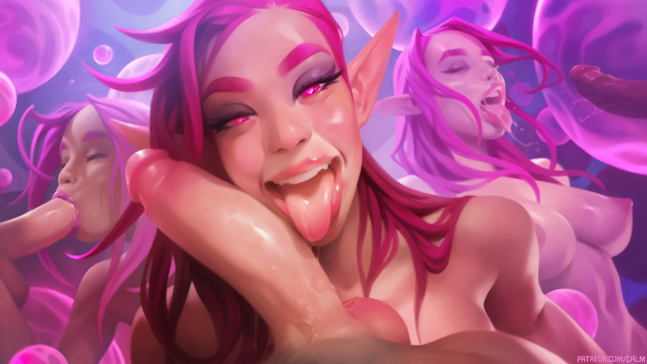
Illustration #86 (Patreon)
Content
This one ended up pretty messy! I hope you like it! These red elves are always a treat to paint. I think I like them more and more every time I paint them. And the sort of abstract environment is fun to occasionally do too!
I'll send you a message with the download links for the rewards for this one on September 7, so keep an eye out for those then.
Throughout making this one I've continued to feel how important it is to not zoom in while I work until it's just the final polish remaining. You'll probably notice this when you watch the time lapse video! I highly recommend giving that a try if you've had a habit of zooming a lot in your own work. I think it's been one of the biggest factors in letting me cut down the amount of time I spend on my illustrations. I used to spend 70-80 hours per illustration, but I'm now down to just under 50. That progress feels good! And I'm enjoying my work more too now that I don't stare at it for quite as many hours, lol.
Thank you for supporting this illustration, it really means a ton to me to be able to make these as a full time job, and I hope to be able to continue doing it for a long time! :)
Files