Home
Home

 Artists
 Search
 Recent
 Random
 Posts
Posts
 DMs
DMs
 Tags
Tags
 Random
 Importer
 Import
 FAQ
FAQ
 Account
 Register
 Favorites
 Login
Login

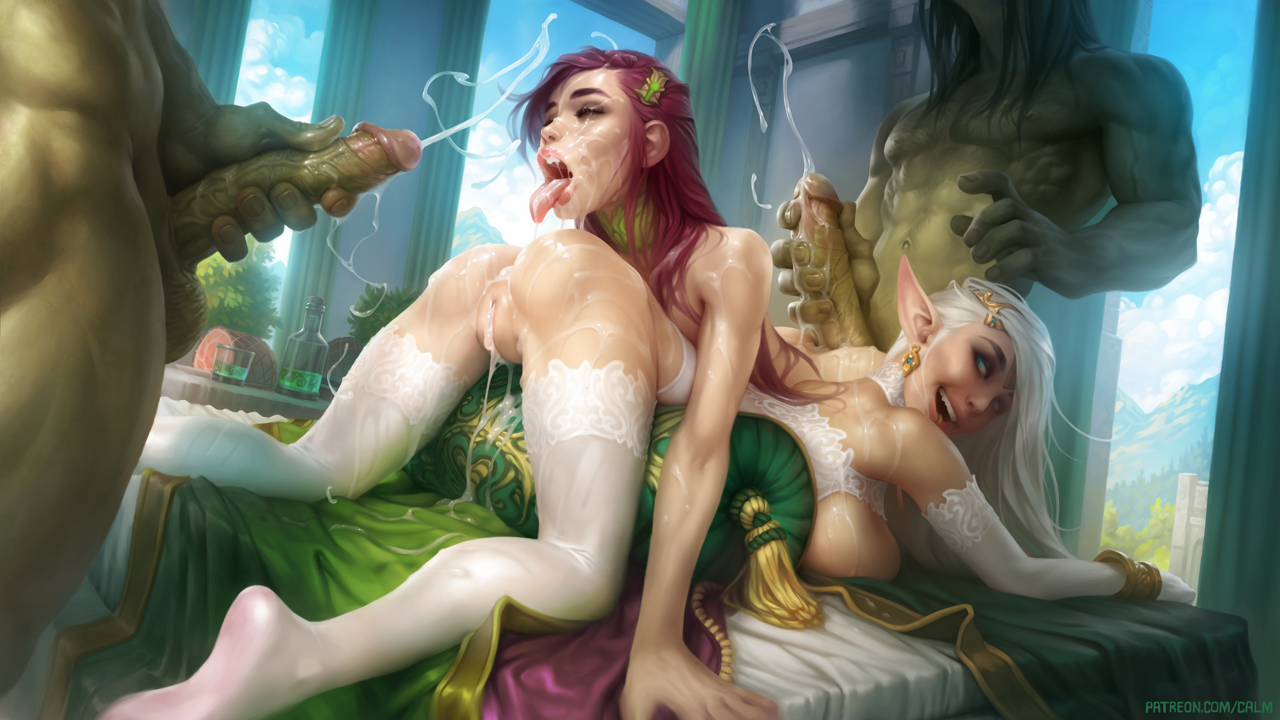
Illustration #57 (Patreon)
Content
Finally done with this one! I hope you guys like it! And I hope you guys don't mind that I changed the appearance of the bottom lady from how she looked in the sketch. I quite like how she turned out here. She looks more interesting than the girl in the sketch, so I feel like it was a good decision. And I even painted some clothes on her! That's a bit unusual.
This illustration was challenging in some ways, but I made some good discoveries throughout it, particularly with regards to the brushes I use. I'd like to make a new set of brushes I can share with you guys when I find the time for it.
Thank you for being patient with me and waiting a few extra days for this one. I'm hoping I won't be behind schedule again at the end of February, but we'll see! It's a short month, so it might happen.
Reward packs for this illustration will be sent out in a few days, on the 7th.
Thank you for supporting me! :)
Files