Home Artists Posts Import Register

Content

Please give us some feed back on this proposed change.
https://github.com/Orcpub/orcpub/issues/428 

Currently we show for proficiencies for weapons, armor and the proficiencies table like

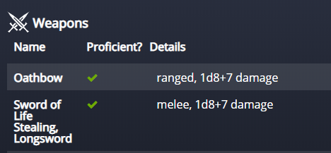
Proposed Change/ Motivation / Use Case
Currently the proficiency is indicated by a check mark in a separate column taking up a lot of space for little (but important) information. I think most people are familiar with the radio buttons that show proficiency on a 5e character sheet so I would suggest using these (with a tooltip) to indicate the proficiency instead of a separate column like so:

Unproficient:

Proficient:

Comments

DungeonMastersVault

If you have other suggestions please post them over on Github so the dev team sees them : ]

Anonymous

Keep the green color to show proficiency too, then the change wont be so jarring.

Anonymous

Yes, but only in unison with https://www.patreon.com/posts/39485073

Anonymous

What do these voting options mean? Yes - do it = Yes show old proficiency tick? Or Yes - do it = Yes show new proficiency circle?

Simone Spinozzi

not only you should do it, but make it a checkbox for custom items! so if a dude finds a firearm, they can make it as a custom item and mark proficiency once they take a level in artificer!

Anonymous

People want to click on radio buttons and it would be confusing if they couldn't. Perhaps just change the "Proficient" title to take up less space.

DungeonMastersVault

I think the question is how we do it so it is most clear : ] Gotta think of the newbies and the seasoned vets. and getting it to work on mobile as well - and color challenged people. With that being said, you get to chime in on what you think might be best.

Anonymous

I like the way the green check mark catches my eye a bit more, though I do like the implementation of radio buttons. Maybe if there was a way to make the actual tick inside the button stand out. I'm not sure about making it stark green like the check, but something to make it pop, even if it were the same color as the text, would be nice.