Home
Home

 Artists
 Search
 Recent
 Random
 Posts
Posts
 DMs
DMs
 Tags
Tags
 Random
 Importer
 Import
 FAQ
FAQ
 Account
 Register
 Favorites
 Login
Login

Should I add a Highlight-Color? [LLL] (Patreon)
Content
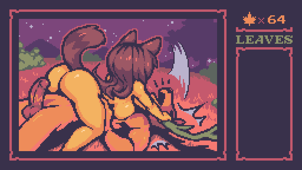
Heyhey, so with the newer CG images there's an increasing amount of Molly skin showing, which brings up a tiny little dilemma...
Basically so far I've created all the games graphics using the same 16 colors, making that my limitation for this ones artstyle. However I've created the palette along with the tileset of the environment, and only afterwards tried it out on the illustrations, which lead to the nonexistence of a highlight color for Molly's skin.
At first it worked out fine without it, but when most of the image is filled with Molly not wearing clothes, it starts looking a little bland in my opinion..
I've made a couple examples with and without the highlight color:


(New images are shaded btw xD)
Generally I think the highlights add alot for plasticity, so I'm leaning towards just saying fuck it, let's just have 17 instead of 16 colors total.
In that case I would go back to all the previous images and add highlights where needed, like so:

Oh yeah another thing, I've tried to get a little more fancy with the lighting in general, I've shaded this pic in my normal shading style at first, but then thought it would make more sense if the moon was this ones lightsource...


This might be my favorite pic out of the CGs so far, looks so atmospherical with the lighting..
So yeah, how do you feel about the highlight color thing?
Square number OCD or the illusion of 3D?
Tell me what you think!
Files