Home
Home

 Artists
 Search
 Recent
 Random
 Posts
Posts
 DMs
DMs
 Tags
Tags
 Random
 Importer
 Import
 FAQ
FAQ
 Account
 Register
 Favorites
 Login
Login

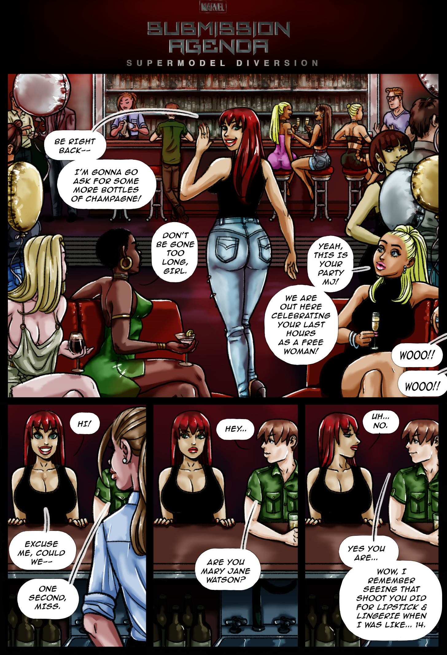
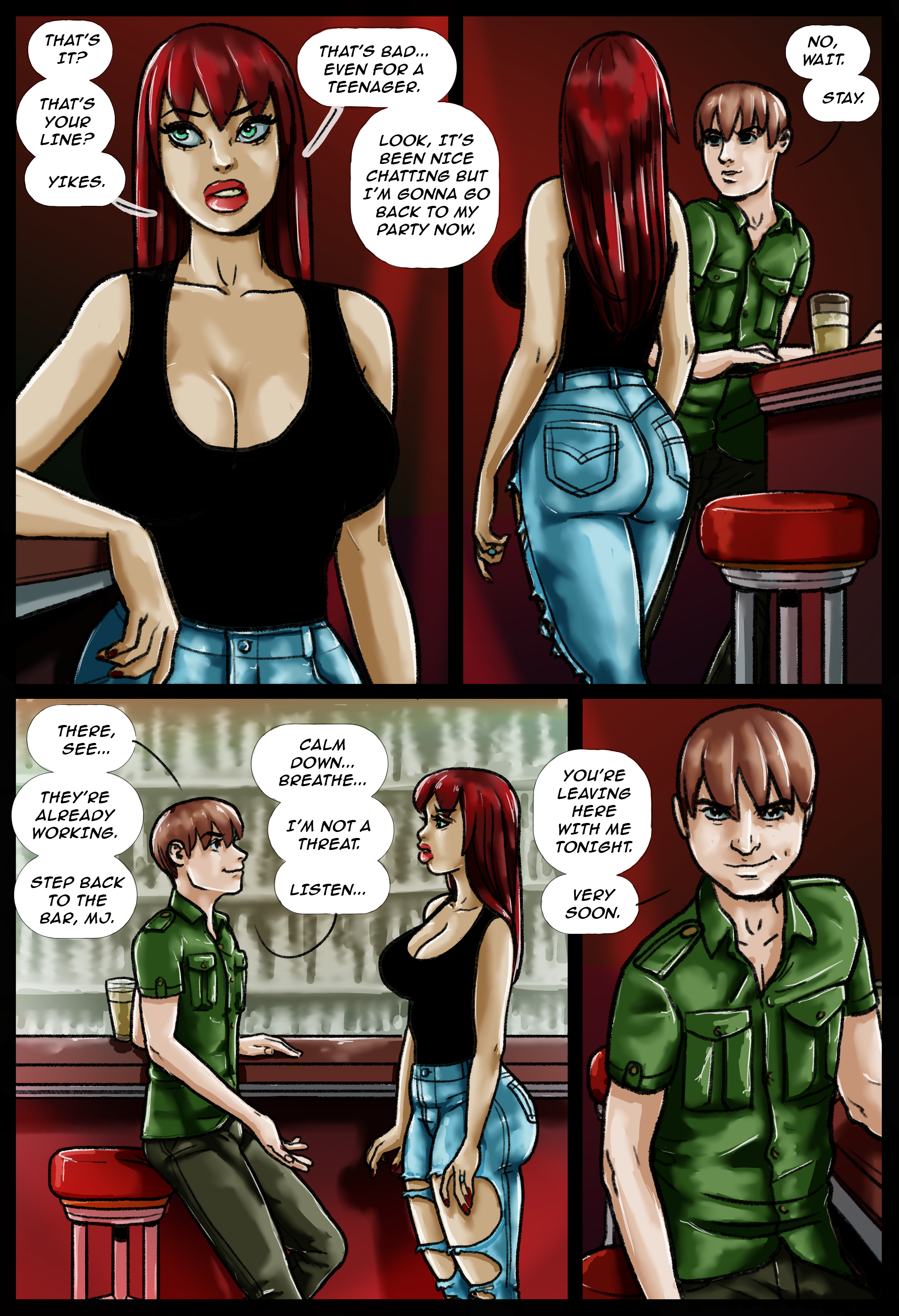
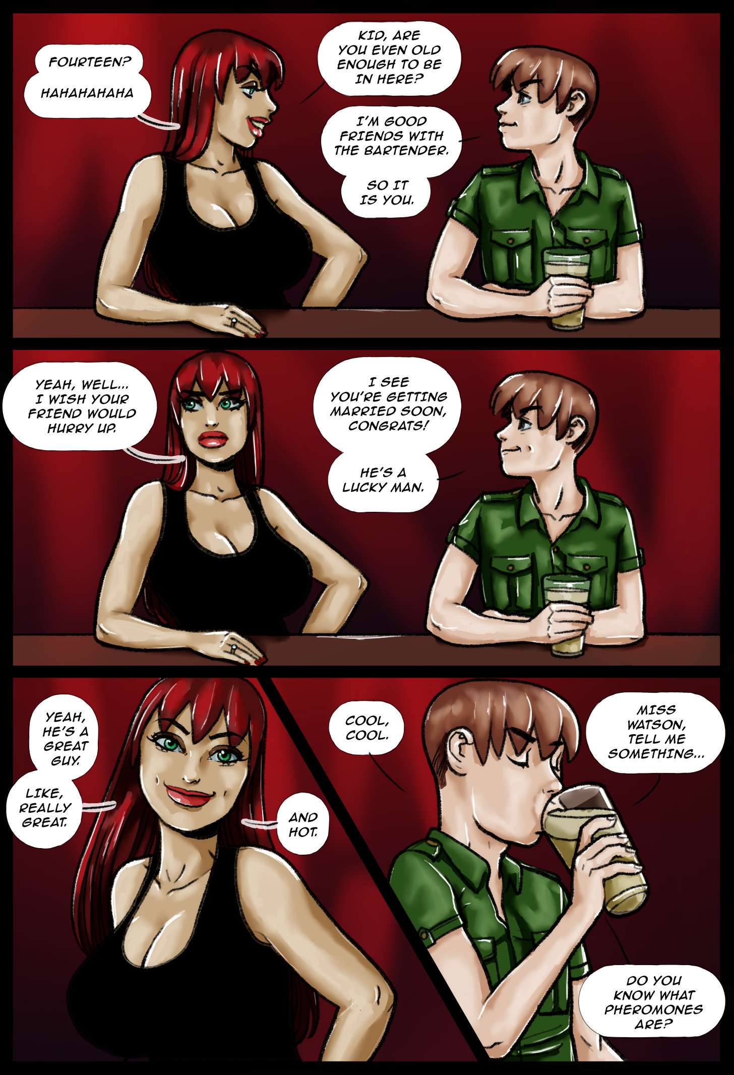
Submission Agenda: Mary Jane Color Pages [TEST] (Patreon)
Published:
2020-05-11 15:10:04
Imported:
2020-10
Content
Hey there,
This is a sort of sneak-peek/test of some upcoming Submission Agenda pages. These are the first three pages of the in-progress chapter "Supermodel Diversion," featuring Miles + MJ's first meeting (I posted the black and white linework on my Extras feed last month).
I'd been planning to go in and shade these in grayscale (as I did with GOT: Blacked and Game Over Girls) but since I had the plain linework, I asked a past collaborator EternityAndVanity to take a stab at coloring them, and I wanted to post them here to get all your feedback.
So, what do you think? Be honest. Would you like a full chapter colored in this style? All thoughts and feedback welcome.
Cheers,
Pegasus
Files