 Home
Home

 Artists
 Search
 Recent
 Random
 Posts
Posts
 DMs
DMs
 Tags
Tags
 Random
 Importer
 Import
 FAQ
FAQ
 Account
 Register
 Favorites
 Login
Login

MA Art Style Announcement! (Details/Art Previews!) (Patreon)
Content
I'll try my best to keep my rambling text to a minimum! This is our second big announcement for 2023! Our first one was the announcement of the "Diaper Influence Gameplay System" coming to MA and is in the works for development behind the scenes for how we're laying that out, connecting it together and making it enjoyable.
If you'd like to check our first big announcement post out, you can do so below!
https://www.patreon.com/posts/diaper-influence-78469951
This announcement might come to a major shock to some and for others who have been paying close attention to our hints into this new year... It might not shock you as much! If you've been paying real close attention lately in 2023 for sprite and cg scene previews, you might've noticed some differences visually? Take a look back at some of our previews from this year after you're finished with this post, if you'd like. :P
(Notice this post is using the recent disclaimer cg art as a highlight? That's because it's actually done in the new style for the game! :O Don't worry, we'll see just how different the style is!)
(Those with oc characters are receiving a free updated .psd file of their character in the new style in the coming months. Consider it a bonus!)
As the post title suggests, yes! We're changing the art style for MA for sprite and cg scenes! We'll dive into the details as to why this is happening and much more as we get further into this post! One important thing to note, is that our goal is to keep what fans love intact. We do understand there's going to be some level of difference in the art, but our intent is to keep things mainly familiar and not extremely out of place.
Before we dive into this huge post of previews and more details, we'd like to remind everyone that we're looking to take feedback and adjust things still to a degree. Your thoughts matter to us! <3
(It should go without saying, development with art doesn't impact the development towards writing, editing or engine work related to delivering new content. The only impact it has with the actual game content being released is that we have to plan around how much of the new art will be included with a given game update/release.)
~Artist Credits: Lisa & MarxeDP & AjoseMp
Let's begin with the sprite art style updates!

Starting off with Allie! This was a difficult decision to make, but beyond the new style, I've struggled to get Allie's visual looking just right for how she comes across in her personality. I feel the biggest thing was to change up her hairstyle a bit to nail this!
Okay, so the art style itself! The main difference from the current style vs the new style is in the faces. Mainly the eyes, but sometimes the nose marking and positioning of the mouth vs nose vs eyes vs eyebrow areas. I think the easier term is to say that the new style is a bit more typical anime-like?
Besides this, the other main change in the style is the way the color/shading is done. It might not show that well with Allie's example above, but the current shading is a bit more sharp? Where the new style goes for a more blended/soft look.
That's mainly the big differences you'll take notice of in these sprite art style previews today! We didn't want to change things more extreme than that. We'll dive more into why all of this is happening after the sprite previews, but I'm rambling too much here... ^^"
Next preview!

We have Brandon! Otherwise known as the protag of the game!
While we don't typically see Brandon's sprite in-game yet, there is plans to showcase his face reactions through the game as part of the text box ui interface. We're still figuring out how that'll look exactly.
One thing about his current sprite that seemed awkward is how his glasses block out much of his eye visuals and so with the new style it was changed a bit. It'd seem he has a bit of a softer look about him too, but hopefully that's for the better and not the worse! ^^"
Next up!

Brandy! Wait... What?
Not to spoil major context for those avoiding spoilers. There is a route in the game where Brandon cross dresses and that's all I'll say of that. :X
I think his softer look in his face works well here a bit more than how it currently does? Hopefully the new style change here has people hyped up!
Let's move along!

It's Erika time!
Now with Erika's sprite in the new style, if you look at her neck and compare the shading to the current sprite. You can get a better idea of what's going on with the skin color blending for shading/shadows better.
You might notice her positioning of her mouth/nose/eye/eyebrows are laid out a bit differently than the current sprite. Hopefully for the better, but let us know what you think!
One big thing about the new style in sprites I've had to consider is just how big or small the eyes should be, along with the outlines/lashes shape to fit the character's personality the best. I didn't want every character to have super huge anime level eyes, but another thing to note is that the eyes in these previews are their "idle" default ones. (Their angry, excited/smiling, sad eyes do change shape to reflect those expressions. The default ones are are big as they get though.)
Moving on!

Oh boy... It's Heather, run! ...Just kidding!
One thing that instantly hit me with the current vs new style for Heather and isn't intentional to point out. It looks like her chest has some lines missing or in other words, to the point. It looks like Heather's chest has been censored, but I assure you all, that isn't the case! If I had noticed this prior to the post, I would've tossed in a view to show her current vs new chest in a bra to really compare the two. >.<
Heather's eyes naturally couldn't be too huge when paired up with her personality, something still between to hit a softer look, but still showcase just how twisted her face looks when she's pissed. (Once again, the eyes in these previews are their "idle" default eyes.)
Let's check out who's next...

Princess Juliet!
I'll try to move along without a ton more text, but one thing I've noticed here for the new style is that maybe it's just me.. But I feel that maybe we'll rework how her nose marking looks? <.< There's something about it that doesn't quite sit right with me, but that'd be a easy fix.
Moving along! (Less rambling! :X )

Wah?! Miki?!
For the past couple days, some of you might've noticed I updated my profile picture on Patreon, Discord or other areas to showcase Miki's new visual look. For those who didn't, that's alright! It was meant to be a little hint towards this whole announcement post anyways. :P
With Miki's preview, you can see the differences much better with the skin color blending, shadow/shading, etc. I think it goes without saying, Miki's personality pairs up well with bigger eyes, but I know sometimes anime level eyes tend to give off the impression that "Big eyes = more youthful". That isn't our intention with the new style in general, so we hope that isn't how stuff might be viewed. <.<
Next!

Nova's here!
I don't think there's a ton more for me to say, but with Nova it was a challenge to figure out how her eye shapes should be, trying to capture her original look in the new style without it feeling like it didn't fit her at all. ^^"
I'd like to think we managed to capture Nova's personality well though!
Next preview!

Nurse Bell tossed in the mix!
Again, differences can be seen with her sprite for the color blending on the skin. Her eyes and face was a bit difficult to get just right, knowing she's in her mid 30's and wanting to consider age differences as a factor too with the style differences. <.<
One more sprite preview!

Rachel!
My main goal with this announcement was to have the main girls to showcase and then beyond that, we'd do little previews later on for other characters in the future.
I feel like Rachel needed to hit that timid shy look to a T... Not to say her current style didn't do that already, but I hope others will feel that her new style look hits home with that feeling more so! ^^
Now before we move along further... Here's expressions of all the main girls in the new style! That way it showcases a better look at how expressive everything looks, differences in eyes for when Heather is happy vs angry, etc.


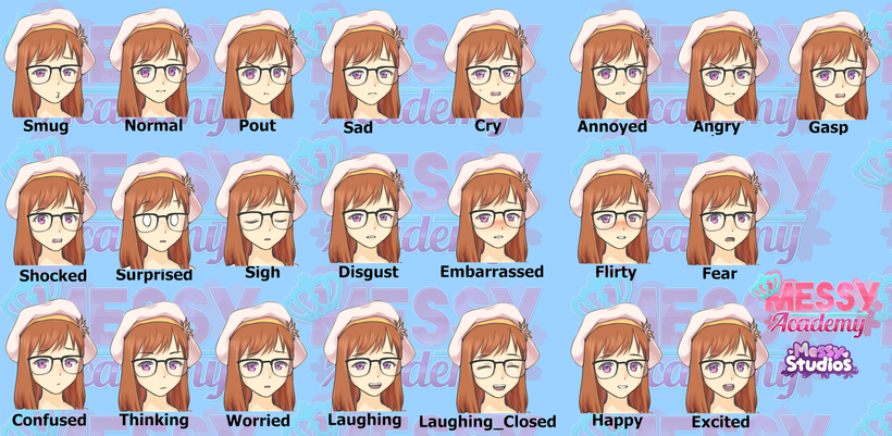

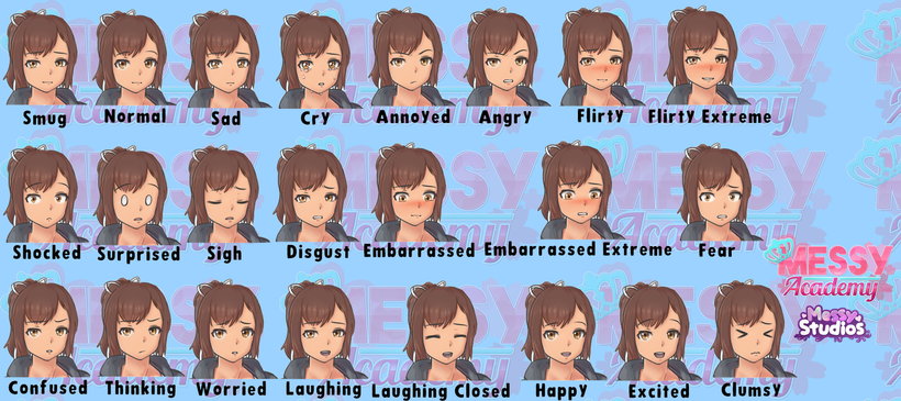
(If you can't view the images in this post to the fullest, please check them out via the start of this post in the gallery feature from Patreon! ^^ )
Before we dive into part two of this announcement post, let me briefly explain the reasoning for the new style in the first place. This will also cover why the cg art is being done in a new style too!
The main reason with the cg art and that isn't to blame our artists for their talent, it's just that when brought up to them about the cg art a while back. They made it known that the current style we've tried to work with for cg art was difficult for them to maintain the same look about characters across the different cg scenes.
What I mean by that is... When you compare how Miki looks in the very first cg scene she's in, the style is very clearly different than how Miki looks when you see a cg scene of her in episode 2 or episode 4, etc. Some differences are subtle enough, but other differences are really noticeable. That in mind, I think it goes without saying that vn's visuals are a key element for the game typically, making sure things look consistent across the board.
Anyways, talking with the cg artists, we came up with a plan to adjust the existing cg art without it taking a ton of time away from creating new cg art. In general to keep things moving along and not going backwards. The idea here with the new style for cg art is that the artists made it clear to me that with the new style, it's more suited in their favor for the process. They can get new cg scenes done quicker than before and that isn't to say the new style is rushed or bad, but for what they're used to doing with art, it's better suited for them.
The short of it is... The new style for cg art is overall easier, faster and better suited for the artists to allow us to get more done quicker vs how we currently do things.
Why is the sprite art style changing if the issue mainly falls on the cg art style?
This was a difficult decision to make, but I knew that the difference between how the characters look in their sprites vs cg art in the new style would've been even more vastly different. So, we tried to update the sprites visuals mainly with the face/eyes to better pair up with the cg art style.
I think at the end of the day, trying to get multiple artists to mimic each other in one given style and keep it consistent is much more difficult than people might think... ^^" So, even the new style for sprites and cg art might have some people scratching their heads in confusion that they're not 100% the same in style either.
The main thing is that they're closer to each other in style to some level and we're still making adjustments based on feedback to get this right.
With that said, I think you amazing fans want to see more visual previews, yes? Let's dive into our first cg comparison preview! (If you can't enlarge the previews below, make use of the gallery feature at the start of this post for full, clear previews!)
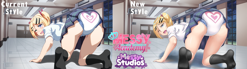
Similar to our intention with sprite art, we didn't want to change things so greatly to where it'd upset people, but the new style is going to naturally have differences to some degree still. ^^"
Here we can breakdown the cg style differences from current to new style!
The first thing is the coloring technique went from a cel-shaded look to a more soft blended/shading look. Some areas have a bit more detail to them as well, like Miki's hair clearly has more color blending and lighting going on.
The big changes we'll see beyond the coloring technique is of course the face shapes and eyes, stuff in that nature. We wanted to try to keep this as close to how things currently look as possible, but touch up the technique for the eye visuals and adjust the eye shapes to suit the sprite style. You'll probably notice other differences too though!
With this Miki scene above, you can notice we adjusted the shape of her diaper to make it feel a bit more thicker than the current style. So, there will be subtle changes to stuff in these previews that we felt would be better fan service, etc. :P
Next preview comparison!

This one is quite a difference and I think the first thing to note is that with the new style, it loses that vibe it originally had going for this moment in the game, right? We'll probably lightly touch it up to nail that mysterious "creepy" vibe it had.
The background itself was updated a bit with the clouds, moon and how that looks. The big area of change beyond the coloring technique is naturally the face area. Rachel's face visuals are meant to be this in-between to match how she sort of looks in her sprite's visuals, but also maintain this "creepy" moment and I think it's safe to say this one needs just a bit of adjustment, because the new style expression alone isn't hitting the same vibe. ^^"
Next!

There's some stuff here on this one to notice! One thing to note that I have to check with the artists, is the kick streak effect that's on the current style is cut off in the new style unintentionally? <.< (The streak line from her foot.)
Ignoring that though, the big difference here is again going to be the face shape and eyes, hair and generally the coloring technique for the skin in general. They had suggested making the sweat feel more subtle as part of her skin, giving that gleam shiny look to it instead.
There might be some corrections done to her eyes a tiny bit still for the new style, but this gives a decent look at how Nova will look in cg art.
Moving along!

One thing about this new style here for the nurse cg scene that sticks out to me a bit as weird looking, is how her mouth/lips are... ^^" But maybe that's just me being picky, it does fit with her sprite's new style in how her mouth layers look with them though.
More hair details clearly can be seen, color blending and I feel that the face and overall appearance of the nurse seems fitting.
Next up!

A few changes with this one, noticing Juliet's in motion as her hair is moving from turning to the viewer/camera during the moment. It does mean her mouth is hidden behind her hair for this cg scene, but I also opted to have the expression changed a bit to suit our first meeting with Juliet as new friends.
One thing I can notice is that the cat ears in the current style feel more fluffy than the new style, but then again.. The context of the scene is that it's a cat girl cosplay, but even then.. <.< Fluffy cat ears are a must! (Noted for tiny fixes)
Her diaper received more padding to feel better looking I hope!
Moving onto the next one!

Here we go! Right away we get a two for one deal in this cg scene comparison. Brandon and Heather to see in the new style!
With Brandon, the artists had suggested making his jacket/top a bit lighter and I feel that was a good call in visuals, same with his pants. One thing to note is that it does make it look like the current style suggests he's clearly wearing a diaper under his pants more so than the new style.. >.< But we're taking notes!
Brandon's face and overall look seems better in the new style I feel.
Heather had a few adjustments, her breasts are pressed up more from her arm pose and her pose in general was altered by the artists request to make it feel a bit better. What do you think though? Current pose vs new style pose?
Her wet diaper seems less colorful than before, but I wanted to have the wetting effects feel a bit more realistic, yet still fan service enough. The big thing with that is the natural spread of the liquid being soaked by the inside padding and how that looks on the outside, added subtle sag just enough as well. Hopefully the new style feels like it gets it right vs the current, but again, let us know! ^^
Heather's hair feels pretty shiny, almost metallic looking to me. I know that's due to the lighting, but we'll have to see how she looks in another cg scene to adjust things lightly with that. ^^" Hopefully her expressions in the face still feel fitting to herself!
Last preview!
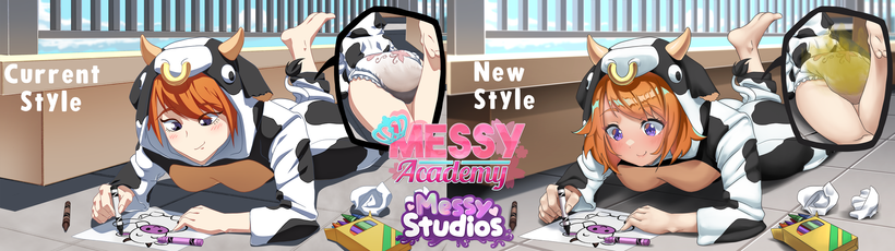
Not a ton of differences here, but I did want to highlight the differences being made for messy visuals as a ending point! The messy visuals here isn't a great comparison because this actually showcases the new stink or fart visuals technically with the new style, which isn't always going to be paired up with every cg scene where a character messes themselves. ^^"
In this case, it makes sense that Zoey is more stinky as the context of the scene in-game brings highlight to this soon after this cg scene moment occurs. So, fear not! We're still trying to include a setting option in the near future to turn off layers for visuals, so in this case, if a player dislikes fart or stink effect stuff like this, it'll instead just not show those visuals.
We'll have a better visual of the new messy look to diapers in a upcoming preview sometime later this month, but for now we hope the wet visuals and this stuff is looking solid!
The main changes again are with the face, eyes and hair. I know we don't have Zoey's sprite in this announcement post to see, but she should feel fairly similar to the new style look. ^^
~Conclusion~
Before you all rush off! >.< I've already explained midway through the post the reasoning behind the new art style for both the sprites and cg scenes, so I won't repeat myself on that.
What's important to note is that we do want to hear your honest feedback, thoughts about this announcement related to the visuals within this post. We're going to be taking note of things to alter lightly even and some of which has been mentioned in the post, but your feedback is important to us! <3
(Once again, this stuff doesn't impact our development for new MA update/releases and we'll have our behind the scenes look at the upcoming MA content for that later this week sometime. That in mind, we don't need mentions of that being brought up in relation to this.)
With that said, this announcement post only features some of the sprites and cg scenes in the new style. We'll be sharing more previews of this each month to highlight everything and just like this post, we'd love to have your thoughts and feedback in making sure we appeal to our fans the greatest on these visuals! ^^
Thank you all for your time in reading through this post!
~ Messy Studios
Files


