Home
Home

 Artists
 Search
 Recent
 Random
 Posts
Posts
 DMs
DMs
 Tags
Tags
 Random
 Importer
 Import
 FAQ
FAQ
 Account
 Register
 Favorites
 Login
Login

Behind the scenes: Wet Visual Improvements! (Patreon)
Content
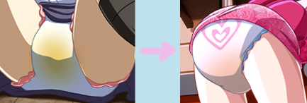
I've mentioned earlier in the month that we'd see some comparisons for the new wet visuals being applied to existing cg art for the game. So here we have our first real look at the differences! ^^
I'll probably make another post like this once I receive more previews to give a broader idea of these changes, but for now just keep in mind these are two completely different pieces of art from MA.
One thing that seemed a bit too goofy to me or not quite as realistic as I was hoping it'd look, while also still having a touch of fantasy for the appeal, was how the wet visuals were looking at times. We can see that on the left, they're very overly bright and kind of comes off in a weird way. (Lighting will affect things a bit, but even then some of these current pieces feel off.)
When doing research around, checking out some famous artists within the community. I took notice that a good part of them seem to dull the colors out, making them feel more faint and almost more like if it were a layer, it's transparency for the coloring would be at 50% or less.
Even with looking at the new wet visual design to the right, I'm sure some of you might find some problems with how it looks. I think part of these changes we'll be making to improve the diaper visuals better will be a hint of subjective tastes from person to person, but I can already tell from some help given within the discord that we'll be taking a better break down look at the diaper designs overall. :P
I should probably warn everyone, not to cause worry, but the diaper designs themselves aren't being changed. If there is some adjusting to the designs, it'd be along the lines of trying to fix up the trim/plastic around the leg holes or lightly fix the waist areas a bit. (Making them feel a bit closer to being realistic, but still weren't not shooting for full on reality either.)
One thing I can say, looking and comparing the two examples. We'll most likely see some breaking down of how highlights and creases, along with some value/form works better in order to improve how the diapers look for cg art currently added with the new wet visuals. I think even if we look at highlights, creases and the value/form of the diapers, it'll go a loooong way in helping make them pop out a bit better and still fit the art style we're trying for MA.
I think that about wraps up this little post for now, but expect to see some more previews comparing old/current cg art to their newly updated versions to see just how things look side by side! ^^
[If you'd like to help us with examples or comments, both visual or non visual references towards what aspects we should focus on with the diapers to make them better. Let us know in the comments below or on the discord!]
Files