Home
Home

 Artists
 Search
 Recent
 Random
 Posts
Posts
 DMs
DMs
 Tags
Tags
 Random
 Importer
 Import
 FAQ
FAQ
 Account
 Register
 Favorites
 Login
Login

This Week in the Forest! #142 (Patreon)
Content
YO FOLKS~! Here's what we've been up to!
Starting with A Word from Vixel!
12/5 weekly update:
Hey floofs! Short update from me! Last week I thoroughly re-playtested Android and used the built in bug report tool to document our remaining bugs and tune-ups. Then I tapped out for a couple days to rest and catch up on life stuff. This week I'll be working on Act 3 story stuff and fixing up our Android build on the side.
Have a lovely week! <3
---
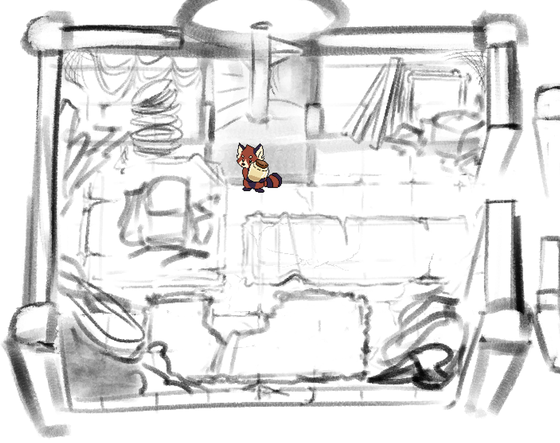
On my end, I've been back to wrestling with Act 4 assets! I keep running into design issues with certain things of how we have our game. Perspective stuff that gets on my nerves, or material stuff that's not quite refined or has the direction I want just yet. SO I've been cookin' and back to the drawing board with this.
The area revealed in Act 4 is gonna be super special, super huge, and frankly probably A LOT more work than I'm prepared for lmao. But I know once I get things nailed down, it'll be a lot easier to start pumping stuff out. And we don't need them yet, and we can introduce them in parts, so it's not a big deal having so much stuff to do!
Problem is settling on a look, and solving some problems. SO I wanted to share what I had cookin' up above!
Our top down approach was going to be inspired off of classic games like Zelda Link to the Past. There's more modern games that use the same top-down approach like Binding of Isaac or Moonlighter.
But these games had a few things in common. The rendering of everything was gamified, things were small, and gameplay did a good job masking some of the "visual issues" in the area. It worked GAMEPLAY wise, but when considering the space the assets actually take up, things fall apart.

Take for example these pots and the Southern wall. Perspective-wise, this is a nightmare. The door as well, having a sprite "walk down" through that door is beyond wonky.
However, in a game, a lot of these visual things end up not being a big deal because the player isn't looking super closely to the visuals. They aren't concerned with the perspective of the camera or the character at any point of the time, so it's not a big deal.
Not to mention, objects end up becoming "symbols" - We don't notice anything about Link, but we know that is our player, and he's facing this way. We're more concerned with attacking or where to go.
That said, I can't shake it being kinda visually stupid in some areas, and I think it's a bit bigger of a deal in a game like ours where the assets are a bit larger. The larger, the more these things stand out and become obvious.
SO, I was doing research.
Now a bit ago, Zelda Link's Awakening was remade. It got a full 3D treatment, and the music is fuckin' awesome. I really wanted to go through it, but I never got around to it. So I was watching some playthroughs to see how they handled it.
Here's the problem, in a 3D space, perspective is built into the medium. YOU CAN cheat it, but usually you can only cheat it from one angle. The remake has the camera angle nearly at 45 degrees shown here.

This looks great, has tons of depth, and gives plenty of room for the player to see everything on the screen. BUT an angle like this would mean any "big things" in the foreground could obscure stuff. Say, walls, or trees.
We ran into this here.

This could work. But it ends up obscuring a lot of space, and also offsets the visual space available in the room.
For the most part. In the Zelda games, their assets are pretty small. so it wasn't really an issue... But what about the dungeons? they have tons of walls... what did they do there?

Well they actually RAISED the camera angle! It's not quite top-down, but 10 or 15 degrees off. We still get a bit of perspective and depth at this angle, yet the walls are now feeling much more familiar like a classic zelda game. (I'm sure this is where some "breaking" happens. They likely stretch out the top/side walls. It looks good at this angle, but I'm really curious at another angle! This might not even be a square at all. Maybe like a bowl shape?)
So here's a really interesting thing. Interiors weren't given the same treatment. The camera is the same angle as normal exploration.

But they actually REMOVED the wall! Now tons of games have done something like this, but I find this an interesting choice given they stuck with the normal top-down in the dungeons. I think this is definitely the way to go, since we can see a ton of details from the assets.
Interesting interesting.
So I did a quick paint over to give the same treatment to the room above.

Now we have something like this.
Definitely MUCH more space in this room!
I think this is an interesting angle for sure. One I'm excited to explore, and that's kinda where things are at with the Act 4 Assets.
Vixel and I spent a good 5 or 6 hours in dev call planning a TON of fun things for this area. That stuff I'm not gonna share. But I need to get this look dev, and workflow feeling good to really start moving ahead with it. Just gotta keep trying stuff. Where it's at is kinda cool now, but it's not quite where I want it.
I'm trying to balance the constraints of keeping this area lore-accurate, and looking cool/interesting. The tile system is new to explore but I feel like it's kinda mandatory for my sanity... But I keep running into things that just aren't quite working with it, I'm sure part of it is my lack of experience with tiled assets. But I'm half wondering if some of this is constraints of "tile" based assets.
Something tells me I'm gonna have to use tiles "quite loosely" or more so just re-use assets really smartly, but basically draw most of it xD.
Anywho the top-most sketch is the most recent look dev for a room. It's got a lot of these things, and a bit of personality/lore elements to decorate it. It's looking ok, but I really need to nail down what I want for the walls. I'm gonna just draw a buncha walls tonight xD.
---
OK THAT'S LONG, but that's it. No easter eggs in this post xD!
Aight, take care y'all!
Files