Home
Home

 Artists
 Search
 Recent
 Random
 Posts
Posts
 DMs
DMs
 Tags
Tags
 Random
 Importer
 Import
 FAQ
FAQ
 Account
 Register
 Favorites
 Login
Login

【2023/02】Process - Newbie (Part 6) | 過程 - Newbie (Part 6) (Pixiv Fanbox)
Videos
-
Newbie part6 Parameters.mp4
Downloads
Content
Newbie (Part 6)! It's been 10 months since the last part, I really miss this series ・゚・(つω`゚)・゚・ Hopefully I still remember how to draw big muscles (?
After a long walk, the soldiers have finally arrived at the camp. But he cannot rest yet, as the hungry soldiers from the campsite has been waiting for their newbie's arrival 👀
Newbie (Part6)!上個part已經是10個月前的事了,我真的好想念這系列啊 ・゚・(つω`゚)・゚・ 希望我還記得大肌肌怎麼畫(?
經過漫長的路程,軍人們終於抵達營地,但他還不能休息,畢竟營地內性慾旺盛的軍人們已經恭候多時了👀
Draft | 草圖
As usual, Design Doll + Blender to experiment the composition and the lighting first :3
I want to create a crowded scene with this one, but it's easy to lose focus when there are so many things to look at; hence, I let someone stand in the foreground to not only create the illusion of crowdedness, but also to frame our main characters.
一如往常的,先用Design Doll + Blender來實驗整體構圖以及光影 :3
我想要創造一個人潮擁擠的場面,但人一多就很容易失去焦點,因此我讓一個人站在最前景,不但能加強人潮擁擠的環繞效果,同時也可以框出我們的主角。
Tilted the camera for a more unstable mood. Blue part is the cropping region.
稍微傾斜了一下相機角度來加強不安定的感覺。藍框是裁切範圍。
Masking Regions | 裁切區域
I want to figure out the general value for different depth, so that I don't lose focus when there are too many characters in the background.
在這邊我想先測試不同景深的明暗,這樣我比較好知道哪些背景人物需要細化才能避免失焦
Lighting | 二分
The lighting should be simple with the main purpose of conveying the form, and the highest contrast will remain on the main characters. I was largely inspired by this YouTube tutorial talking about good art as "being easy on the eyes" and I'm interested in trying to implement some of the theories: https://youtu.be/MDiysZ4eglc
我試著讓二分越簡單越好,主要目的是以最少的光來傳遞最多的體積訊息,而光影對比最強的部份只會出現在主角身上。我主要是受到這個YouTube教學影響,裡面談到「看起來舒服 (being easy on the eyes)」的原則,而我想要實踐看看裡面的一些理論:https://youtu.be/MDiysZ4eglc
Grayscale | 灰階
For me, when it comes to clothing it's much faster to just block in the color shapes at this stage instead of drawing their individual lines since the layers could get very messy. Which is why my characters are usually naked before this stage :3
對我來說用色塊來起稿衣物比起從線條來起稿要來得直覺很多,從線條階段就開始畫的話很容易會讓圖層凌亂,這也是為什麼我角色在這個階段之前基本上都是裸體的:3
Color Variation | 藏色
Done with gradient map, introducing a bit of color variation will make the end result look a lot more interesting!
用漸層對應完成的,在這個階段有一些顏色變化會讓最後結果變得好看很多!
Colored Draft | 上色草稿
I was going to paint the military uniform green like the ones we see in previous parts, but I realize that dark grey actually makes the skin color pop a lot more, since they're units at the camp site, I guess it's okay for their uniform to be different (。ò ∀ ó。)
我原本想要讓軍裝跟過往的part一樣是綠色的,但我發現深灰色比起綠色更能夠透出皮膚的香味,畢竟他們是隸屬於營地的軍人,他們的軍裝不太一樣也沒關係吧(。ò ∀ ó。)
Rendering (Background) | 細修(背景)
Rendering (Main Characters) | 細修(主角)
The big guy's head design was changed drastically as he looked too similar to Orca before the change. I added a tactical knife on the side of his boot to not only entertain his soldier background, but also to emphasize the dangerous atmosphere.
I'm super turned on by big guys who are fully naked but wearing military boots ⁄(⁄ ⁄•⁄ω⁄•⁄ ⁄)⁄
大肌肌的長相整個大改,因為原本太接近Orca的設定了。我在他的靴子邊加上了一把軍用短刀,一方面是強調軍人的設定,但同時也能讓氛圍變得有更危險的感覺。
我對全裸但只穿軍靴的男生真的毫無抵抗力RRRRR ⁄(⁄ ⁄•⁄ω⁄•⁄ ⁄)⁄
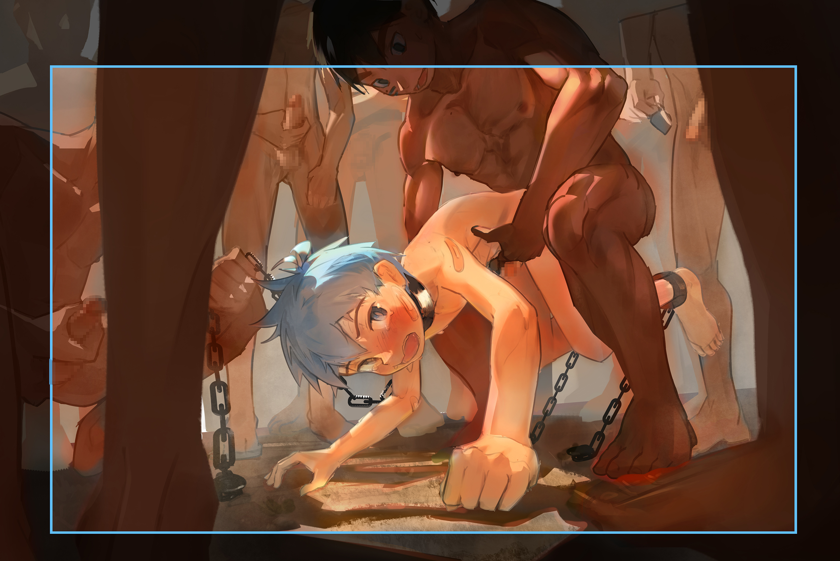
The position of Sand is quite interesting, I want the big boi to fuck him while lifting him off the ground, but this also meant he could escape easily by doing a forward roll; thus, why there are chains locking the ankle to prevent attempts at escaping (?
I'm considering doing another 1-page manga to introduce the setting, but we'll see if my schedule allows that XD
沙子的姿勢其實挺有趣的,我想讓大肌肌把他懸空抱著幹,但這同時也代表他能夠輕易往前翻滾逃離,為了避免有逃脫的可能性,雙腳懷才會也被鎖起來(?
我有考慮像上次一樣畫一頁漫畫來介紹設定,但不確定時間夠不夠XD
Rendering (Side Characters) | 細修(配角)
Post-Processing | 後製
Added lens flare, more light bloom, color correction, and included blur for depth. Time to work on the manga!
增加了鏡頭耀光(lens flare)、更多光暈、顏色調整、以及加了模糊效果來加強景深感。
是時候來畫漫畫啦!
Storyboard (Manga) | 分鏡(漫畫)
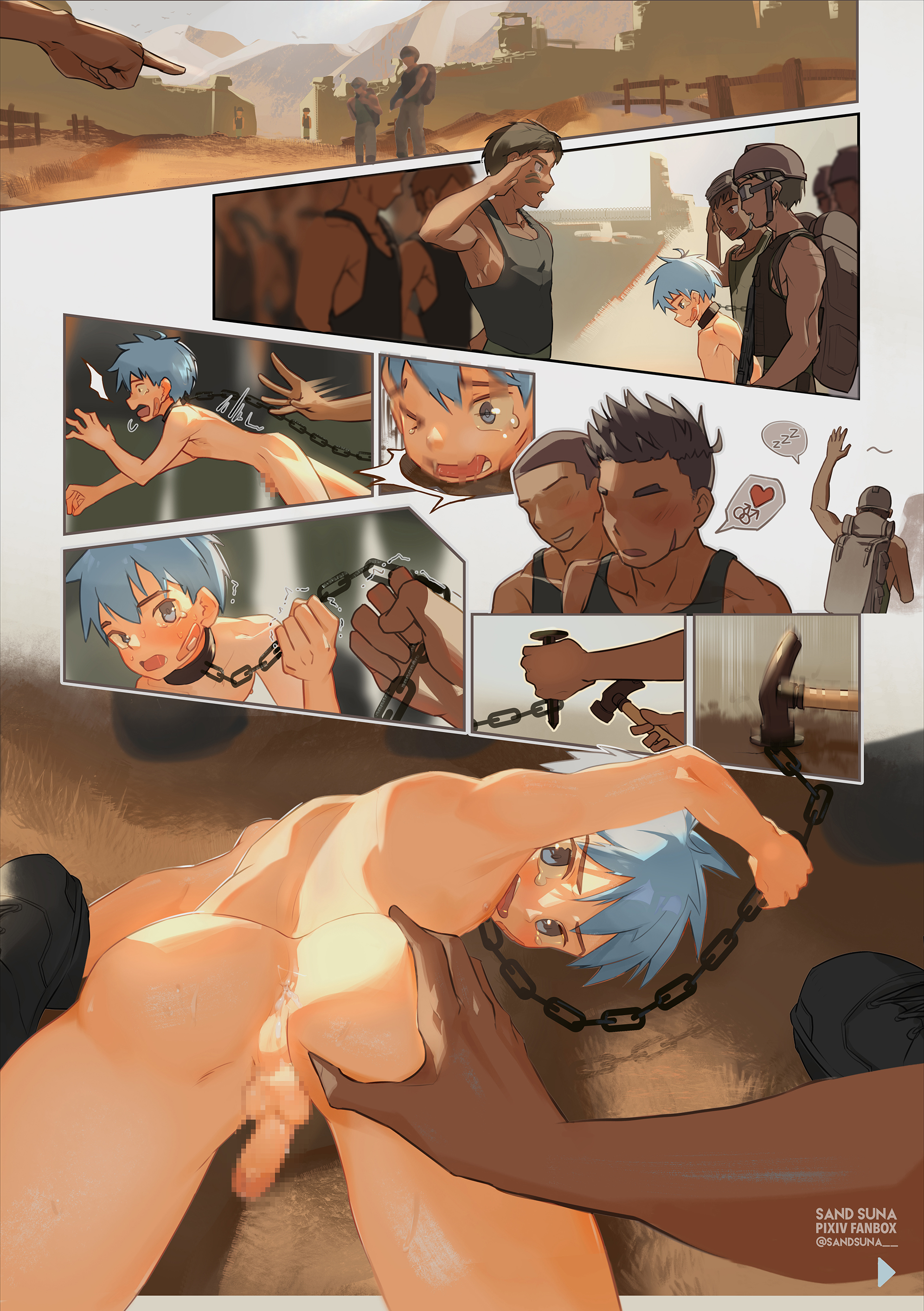
For the manga, I want to show their arrival at the campsite → meeting with the new crew → handing off the Newbie → Orca's team going to rest → they began chaining the Newbie to the floor → they realized that the Newbie already has cum in his ass ready to be fucked, probably because Orca's team had some fun on their way here ( •᷄ὤ•᷅)
漫畫的話,我想要呈現出:他們抵達駐紮地 → 跟駐紮地的軍人碰面 → 將Newbie交給對方 → Orca的小隊去休息了 → 他們開始把Newbie釘在地上 → 他們發現Newbie屁屁內已經有精液,可以直接開幹了,八成是因為Orca的小隊在來的路上就已經先玩幾輪了 ( •᷄ὤ•᷅)
Version 1
第一版
Version 2. Much better flow and spacing, easier to understand the story.
第二版。相較之下閱讀起來更流暢、空間運用也較好,比較容易理解故事。
Draft (Manga) | 草稿(漫畫)
Line Art (Manga) | 線稿(漫畫)
Once again, it's rare for me to draw lines, but this time I want to attempt cel-shading again for efficiency; hence, why I felt it's necessary to retrace line for this.
又很難得地描了線稿,這次想為了效率再次挑戰賽璐璐風格所以才特別描線的
Lighting (Manga) | 二分(漫畫)
Base Color (Manga) | 底色(漫畫)
Rendering (Manga) | 細修(漫畫)
Added sub-surface scattering, shifts in base color hue, highlights, ambience, and textures.
增加了次表面散射、固有色的變化、高光、環境效果、以及材質表現
Post-Processing (Manga) | 後製(漫畫)
That's it! Time to ask Draugnut for his opinion ♪⁽⁽٩( ᐖ )۶⁾⁾ ₍₍٩( ᐛ )۶₎₎♪
This page was surprisingly quick to complete, took around 3 full-days of working.
完成啦!是時候問爪爪的意見了♪⁽⁽٩( ᐖ )۶⁾⁾ ₍₍٩( ᐛ )۶₎₎♪
這頁完成意外地快,只花了完整三天的工作時間。
Draugnut's Suggestion | 爪爪的建議
@Draugnut suggested to make the arm thickness for the big guy more similar despite the perspective distortion, the original version was too thin. There were also minor fixes to the thigh and the boot knife's size. The lighting on the big guy's muscle feels much more natural now
@爪爪 建議把大肌肌的手臂粗細弄得接近一點,儘管有透視扭曲也一樣,原本的直覺看起來太細。也有稍微調整短刀的大小以及大腿的體積。大肌肌的光影調整過後看起來也自然了許多
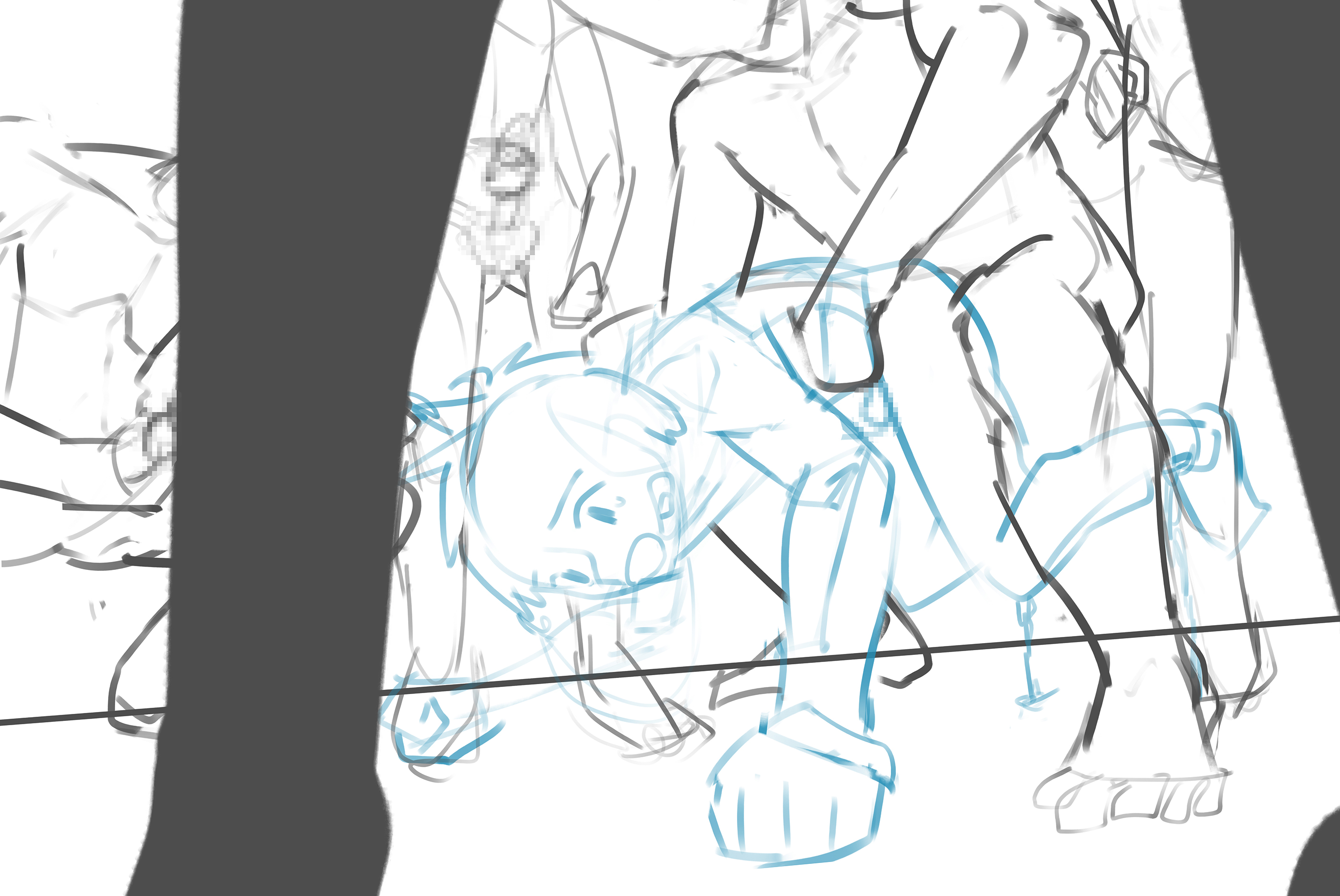
There were more changes on the manga here, mostly regarding the use of space. He said that my original version had too many white space, but the purpose was unclear. He also mentioned how on the main image, the shota's back had too many fragmented lighting, using a larger shape to interpret the lighting is much more comfortable. He said the way I was grabbing the chain was unclear; thus, recommended to have the left hand stepped on by the others.
Huge thanks to Draugnut, I learned so much about manga, still a long way for me to go tho ´・ᴗ・`
漫畫這邊則有挺多修改的,主要是有關空間的運用。原版有太多留白,但是意義卻不明確。他也提到了主圖正太背上的光影太破碎,建議用大型狀來概括,看起來舒服非常多。他也說我抓鐵鍊的姿勢不太明確,建議讓左手被踩住。
超感謝爪爪的,這次學了很多漫畫的表現方法,不過還有很長的一段路要走呢 ´・ᴗ・`
Live2D Parameters
Phew... the animation took longer to produce than the illustration itself.
呼… 這次動畫比插畫本身還花了更多時間
This time, the most difficult thing is I tried to make the chains more dynamic by separating the individual pieces into its own object, then hooking them up together with a rotational deformer. Then, everything is positioned depending on the movement using the physics control :3
這次最困難的環節是讓鐵鍊變得更真實,做法是先把每節鐵鍊都分成不同的圖層/物件,接著再用rotational deformer把它們串起來,最後則是用物理演算來算出不同體位該呈現出什麼樣的鐵鍊形狀:3
Files