Home
Home

 Artists
 Search
 Recent
 Random
 Posts
Posts
 DMs
DMs
 Tags
Tags
 Random
 Importer
 Import
 FAQ
FAQ
 Account
 Register
 Favorites
 Login
Login

【Tutorial | 教學】Quick Color Matching | 快速匹配顏色法【Difficulty | 難度 ★★☆☆☆】 (Pixiv Fanbox)
Downloads
Content
Learning Materials | 教材:
bantersnaps-mE_yfvS0TSY-unsplash
※Note: The version of the Photoshop I am using is Photoshop CC 21.0.3. But it should work with any version above Photoshop CS6
※提醒:我用的Photoshop版本是Photoshop CC 21.0.3。但依據我的了解,任何Photoshop CS6 以後的版本皆可使用此功能
✨Please do NOT download/reupload, redistribute, or share my contents on this site to any other platform without my permission, thanks!
✨請勿在未經過我的允許前將我的作品:下載/重新上傳 or 分享至其他平台,謝謝!
【The Basic | 基本】 【Difficulty | 難度 ★☆☆☆☆】
1. Open Photoshop and drag in the background image.
1. 打開Photoshop並將背景圖片放進去
2. Drag the transparent character into the file too
2. 將透明去背的角色放進圖片中
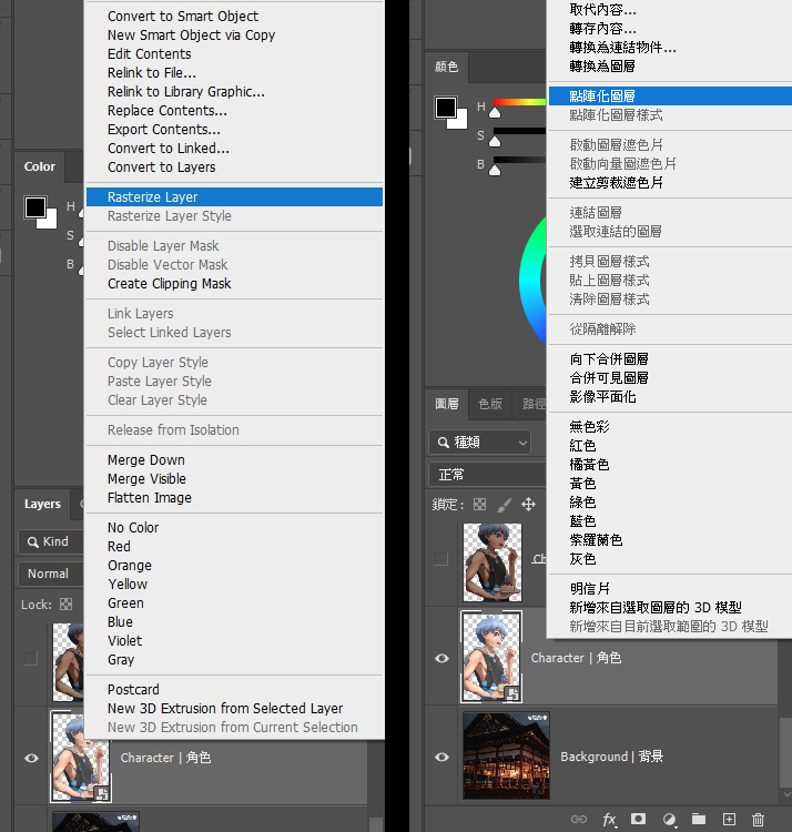
3. Right click on the character layer and choose "Rasterize Layer"
3. 右鍵角色的圖層,並選擇「點陣化圖層」
4. Go to top left corner's [Image] -> [Adjustments] -> [Match Color]
4. 到左上角的 [影像] -> [調整] -> [符合顏色]
5. Click on [Source: ] and choose the current PSD you are working on.
5. 點選 [來源: ] 並選取你目前正在使用的PSD.
6. For [Layer: ], choose the background layer. This is the layer/environment your character will be referencing.
6. 在 [圖層: ]選擇背景的圖層。這個步驟將定義角色所參考的環境顏色。
7. Adjust to your liking, for this case, I only changed the fade to 50 to weaken the effect.
7. 依照個人喜好調整上面的三個值。這次我只有改[淡化]為50,讓效果不要太強烈。
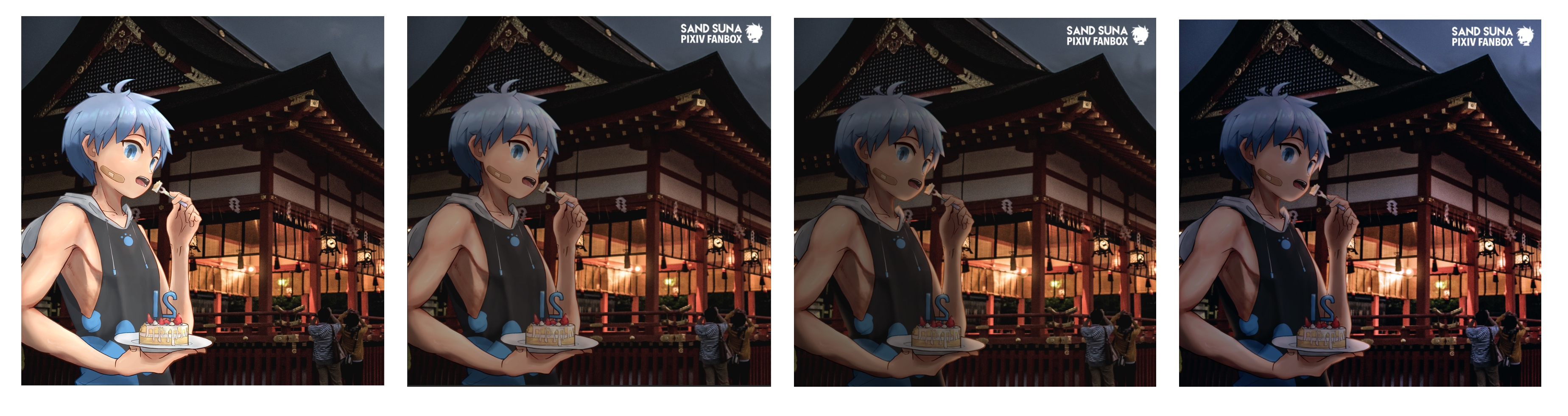
Already looks so much better! Let's see what else we can do to enhance this!
現在已經看起來好多了!讓我們繼續加強效果吧!
Next, we will consider the lighting. As you can see, most of the environment is quite dark, and the main light source is the yellow/orange light from the building behind.
接下來,我們要做的是加強光影。我們可以看見大部分的環境都很陰暗,而主要的光源是來自角色後方屋子內的橘黃光。
【Lighting | 打光】 【Difficulty | 難度 ★★☆☆☆】
8. Create a new layer, right click on the layer, and have it clipped to the character layer.
8. 建立一個新的圖層,右鍵此圖層,並將該圖層設定為角色圖層的遮色片
Now, whatever we draw on the layer, will not surpass the area of the character layer.
現在我們不管在這個圖層上畫什麼都不會超出角色圖層的範圍囉。
9. Change the layer blend mode to [Screen]
9. 改變圖層混合模式為 [濾色]
10. Choose a color that closely resembles the color of the light
10. 選取一個與燈光接近的顏色
11. Choose an air-brush that has 0% hardness
11. 選取一個軟硬度為0%的噴槍筆刷
12. Gently add light using this brush, depending on where the light is coming from. Since the light is coming from the back, it will mainly show up on the rim. Your light does not have to be 100% accurate or realistic, sometimes, aesthetics is what matters :3.
12. 輕微地用這個筆刷在光照亮的地方加上光源。由於光來自背後,角色只有輪廓會被照亮。光不需要100%精準或是寫實,有時候美觀更重用 :3
13. Repeat the steps above, but instead, use [Color Dodge] as layer blend mode this time. This will be used to enhance the light.
13. 重複上面的步驟,但這次使用「加亮光源」的混合模式,加強光的效果
14. Time to add shadow, add a new layer and use [Multiplay] as layer blend mode this time. This time, choose a dark color instead.
14. 該加點陰影了,新增一個圖層並使用「色彩增值」的混合模式。這次,與其選用亮色,選一個接近黑色的暗色。
Because the purpose is to darken the entire character, as you can see, I have pretty much added darkness in every part of the character. (The red part is the part that got darkened)
由於我們的目的是讓角色整體顏色變暗,下圖可以看見幾乎整個角色都有被我塗黑(紅色的區域為加深的區域)
Much better with lighting!
加了光影後好多了!
【Color Adjustment | 顏色調整】 【Difficulty | 難度 ★☆☆☆☆】
Let's add some filter and adjust some colors to make everything more coherent!
來加點濾鏡並改點顏色來讓整個畫面更一致吧!
15. Add a [Color Lookup] adjustment layer.
15. 新增一個 [顏色查詢] 的修改圖層。
16. Choose a filter that you like. In this case, I will choose Crisp_Warm
16. 選一個你喜歡的濾鏡。這個範例中我用的是Crisp_Warm
17. You can weaken the effect by changing the layer's opacity to lower values.
17. 我們可以修改不透明度讓濾鏡效果不要那麼強烈。
18. We can also add a curves adjustment layer to alter the contrast or brightness
18. 我們可以加一個曲線調整圖層來修改對比與亮度
19. Select all layers. You can either click one layer, then shift click another layer to mark the start and end selection, or you can select each layer one by clicking layers while holding ctrl.
19. 選取所有圖層。你可以點一個圖層,接著按著Shift點另一個圖層,這樣所有中間的圖層都會被選曲。或是你也可以在點不同圖層的時候按著Ctrl,這樣就可以一個一個選取你要得圖層。
20. Right click and merge layers. Now you should only have 1 layer left.
20. 右鍵並合併圖層。現在你應該只會剩下一個圖層。
21. Go to [Image] -> Choose either of the three options below. Let Photoshop do the magic!
21. 接著,到[影像] -> 選取任何一個自動調整的選項。Photoshop真的是黑科技...
We are done! Looks so much better doesn't it!
終於完成了!比以前看起來好多了對吧?
※In the future, I may skip certain steps for tutorials marked with higher difficulties.
※未來我可能會在難度高的教學中跳過/簡化一些步驟。
Feel free to DM me or leave a comment if you encounter any issues or have any questions, I will try my best answering them.
有任何問題的話歡迎私訊或留言,我會盡力解答的。
Files