 Home
Home

 Artists
 Search
 Recent
 Random
 Posts
Posts
 DMs
DMs
 Tags
Tags
 Random
 Importer
 Import
 FAQ
FAQ
 Account
 Register
 Favorites
 Login
Login

PixelArt production record "snow station"(4/6) (Patreon)
Content
"PixelArt production record 01". This is a $4(japanese) or $7(translated) article on shopify.
But we will translate it into English and publish it in 6 articles on patreon. This is a patron benefit.
I will be posting the first chapter, "Until I Started Drawing Pixel Paintings.
This is a readable The technical discussion begins at part 3/6.
Reason: English translation takes time. Patron benefit is needed. I do not yet have a standard to distinguish patrons by amount, etc.
Previous : PixelArt production record "snow station"(3/6)
Next : PixelArt production record "snow station"(5/6)
---
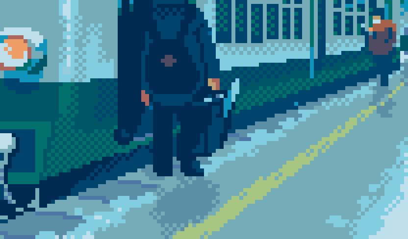
3-1 Person Lv3 Tonal Correction
Draw Persons
Where there are persons tends to be the point of gaze. It's ideal to finish drawing two train conductors in the forefront first as a guide for the whole image. You can get a more polite sense of density by making each pixel stand out with oblique lines, meshes, or approximate color outlines, but be careful not to overdo it. Overdoing causes a needless strong impression.
At another station, It was impressive a train conductor looking at the distant passengers, so I let the two train conductors look at the back, and it was suitable. It naturally leads the viewer's gaze to the back.
Adjust Color Balance
At the same time as drawing persons, adjust the color tone of the screen. Once I decide on the color tone, I can predict the finished form, making the work fun. The more I draw in detail with many colors, the more it's fun to adjust tones, so I set aside this task until the latter half and do it during breaks.

I use "Tonal Correction/ Color Balance" or "RGB Adjustment" (the name depends on the editors). I often change R in the negative direction. Be careful that some editors have sliders affecting extreme.
Adjust Brightness and Contrast
In addition, "Brightness, Contrast" or "Level Correction" is also helpful. Increasing the brightness to reduce the contrast or increasing the darkness will give a soft impression. Tonal correction is easy and fun, so I recommend enjoying tonal correction after the drawing is almost finished.
Since tonal correction is a process that narrows the color gamut, some colors will be indistinguishably depending on the palette condition. When you find such colors after tonal correction, integrate them with similar colors, or make the difference clear in color value to adjust colors in the palette just enough.

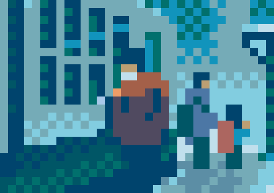
As an aside, tonal correction of the pixel art editor first applies to the colors stored in the palette, and next, it reflects on the canvas (see image above). It’s a software functionality for index color images such as GIF and BMP, and impossible with software such as CLIP STUDIO, which handles full-color by JPG and PNG.
Pay Attention to the Colors of a Gaze Point
Since a human face is very often attention, I adjusted the color tones again manually to make it easy to see the color difference between the mask, mask shade, face, and face shade.
The mask has a cold glitter surface scattering, so I made the light blue distinct for the mask shade and used the same color for snow. Since a human face has warm surface scattering, I made the skin redder. The skin color includes somewhat blue by tonal correction. I did it well to four colors coexist in good balance.

Color balance is a function that "makes all colors closer to the same color." It may happen to overcorrect until getting used to it, so I do my best to determine the "just right degree." Overdoing ends up monotonous and boring, and it's not easy to restore those colors to their original. If my eyes get tired, I go outside and take a break.
3-2 Train Lv3

Draw the Face of the Train
The face of the train is regular and organic, so it was a fun part. I used mesh for the shade to express that the cab was dark and unclear. I distort the shape of the lights for my dare, then each pixel of the periphery is alive. I didn't intend to put the outline of each motif, but I put a little on only the lower left and right of the train to give it a presence.
Playful to Be Flexible
Those are my recent ways of drawing, and there are many other playful ways and rough parts. I want to be flexible and not decide my method too much. It's better than looking overly tight.
I couldn't think of an excellent way to express the corners of the train body round, so I used two bright colors appropriately and got it done. It's just because of a lack of skill, and I want to do it well someday.
Adjust Lines Not to Look Bent
Look at the side windows. It seems regular and easy to draw, but a steep perspective in-depth makes the lines rickety. Objects with straight lines generally give a sense of direction and stability but are sometimes counterproductive in pixel art. This time, I "hid" rickety lines at points where the vertical lines intersect. I think this is one of many processing methods.

It's a matter of preference. The edition on the left is cluttered, somewhat generative, and cold. Some people may feel the edition on the right is unnatural and unpleasant. I adopted the edition on the right to avoid complicating the screen in preparation for adding snow later.
3-3 Background Lv3
Drawing a foreground adds to the overall convincingness and enables to express a distant person or a ship on the horizon with just a few pixels. It's a true pleasure, and I always feel like I'm taking a victory lap when I work on this stage.
Train Platform
I retouched background Lv2 while drawing persons to fit the perspective, and all the lines began radiating up from the valley in the back. Ordinary artists might forecast this in advance, but I can't. I want to be able to do it eventually.

Add fallen snow to the train platform and process as I please. For example, the yellow line became jaggy because the straight line was too conspicuous. I roughened the snow with a tone mesh to give the snow a texture. The shadow color of the snow is the same as the shadow color of the mask. This color is surface scattered in the light and was originally white.
Now that the colors I need are ready in my pallet. I will try to reuse them in many parts by shifting colors slightly to bring tastefulness.
Person Color
I wanted to use red which reminds me of vitality and fever for a child, and at the same time, I came up with the action of carrying a backpack on his back. So, I made the backpack red to stand out. The parent is also colored a little warm.
The clothes were brighter than their hair, and there were aerial perspectives and snow reflections, so I used a viridian-like color for their trousers. This color was one brighter color than navy blue on my palette by chance.
The person's figure near the center was left only to check the size, but I decided to paint him because a long time of checking made me attached to him. This person's trousers aren't viridian to avoid assimilation with the parent and child and other backgrounds.
Structure in the Back
I fleshed out the station structure in the back, aware of the perspective projection of what I had already drawn. Adding lines in the structure’s shadow gives a structured character somehow, and selecting those own colors even in dark areas leads to colorfulness. While doing so, I draw just soberly and variously.
Mountain in the Back
There is a cedar mountain covered with light snow in the back. Cedars have branches, leaves, and snow, but I took the plunge and simplified it with a mesh. I wouldn't apply the mesh to give it a transparent feel if I were a while ago.

I couldn't see how the snow was actually piled up, but I thought that the lower part might look whitish due to the snowfall and reflections in the wind, so I softened the white.
3-4 Finishing a Still Image
The whole is now Lv3. The sense of accomplishment makes me feel that it’s an even better work.

A Break is Also Necessary
When I finish a still image, I take a break to organize the palette and adjust the color tone taking something to drink. Leaving the screen for a while makes me notice parts too complicated or mistakes overlooked. It's best to sleep and look back. It's also better to show others.
Once I begin the animation work, every correction work time will increase several times. That's just when an earthquake and a blackout tend to happen. It happened in practice! So as not to occur in such situations, when I feel something doesn't match, I boldly erase the part and its surrounding area with a circular tool. It’s better to have finished redrawing during the still image work.
Next : record (5/6)